10 alternative a Power BI selezionate per il 2026

10 Shortlist delle migliori alternative a Power BI


Una valida alternativa a Power BI offre al tuo team flessibilità nella modellazione dei dati, dashboard interattive e integrazione affidabile con le sorgenti dati esistenti. Se stai cercando opzioni oltre Power BI, probabilmente hai bisogno di una piattaforma di business intelligence che soddisfi le tue esigenze di reporting, supporti i tuoi flussi di lavoro e si adatti alla scala della tua organizzazione.
Questo elenco ti aiuterà a confrontare le principali alternative a Power BI, mettendo in evidenza i punti di forza di ciascun strumento per consentirti di prendere una decisione informata per la tua strategia di analisi dei dati.
Che cos'è Power BI?
Power BI è uno strumento di business intelligence di Microsoft che aiuta le organizzazioni a visualizzare, analizzare e condividere insight basati sui dati. Si collega a diverse fonti di dati, permettendo agli utenti di creare dashboard e report a supporto delle decisioni in cloud. Power BI è ampiamente utilizzato da analisti, team di dati e manager aziendali che necessitano di potenti capacità di analisi e insight in tempo reale per monitorare le prestazioni e individuare tendenze.
La piattaforma include funzionalità avanzate per modellazione e trasformazione dei dati, ma alcuni utenti possono incontrare una curva di apprendimento significativa quando affrontano flussi di lavoro più complessi. Sebbene offra un'interfaccia user-friendly per la reportistica di base, alcuni casi d'uso richiedono comunque competenze tecniche, soprattutto a livello enterprise nell'analisi dei dati.
Sintesi delle migliori alternative a Power BI
Questa tabella comparativa riassume i dettagli sui prezzi delle mie migliori alternative a Power BI per aiutarti a trovare la soluzione più adatta al tuo budget e alle esigenze aziendali.
| Tool | Best For | Trial Info | Price | ||
|---|---|---|---|---|---|
| 1 | Best for cross-channel customer tracking | Free trial + free demo available | Pricing upon request | Website | |
| 2 | Best for interactive visual exploration | Free plan available | From $15/user/month (billed annually) | Website | |
| 3 | Best for embedded analytics customization | Free plan available | From $9/user/project/month | Website | |
| 4 | Best for real-time dashboard sharing | 30-day free trial + free demo available | Pricing upon request | Website | |
| 5 | Best for complex data integration | 7-day free trial + free demo available | Pricing upon request | Website | |
| 6 | Best for enterprise planning alignment | Free demo available | Pricing upon request | Website | |
| 7 | Best for AI-powered data insights | 30-day free trial available | From $11.25/user/month | Website | |
| 8 | Best for embedded analytics customization | Free plan available | Pricing upon request | Website | |
| 9 | Best with associative data modeling | Free trial available | From $300/10 users/month (billed annually) | Website | |
| 10 | Best for open-source deployment flexibility | Free plan and 14-day free trial | From $100/month + $6/month per user (Includes first 5 users) | Website |
Why Trust Our Software Reviews
We’ve been testing and reviewing software since 2020. As CX leaders ourselves, we know how critical and difficult it is to make the right decision when selecting software.
We invest in deep research to help our audience make better software purchasing decisions. We’ve tested more than 2,000 tools for different CX use cases and written over 1,000 comprehensive software reviews. Learn how we stay transparent & our software review methodology.
-

SupportYourApp
Visit WebsiteThis is an aggregated rating for this tool including ratings from Crozdesk users and ratings from other sites.4.7 -
Tidio
Visit WebsiteThis is an aggregated rating for this tool including ratings from Crozdesk users and ratings from other sites.4.7 -
Freshdesk
Visit WebsiteThis is an aggregated rating for this tool including ratings from Crozdesk users and ratings from other sites.4.4


Recensioni delle alternative a Power BI
Qui di seguito trovi le mie sintesi dettagliate delle migliori alternative a Power BI che sono state incluse nella mia shortlist. Le mie recensioni offrono uno sguardo approfondito su funzionalità, integrazioni e i migliori casi d’uso di ciascuna piattaforma per aiutarti a trovare quella più adatta a te.
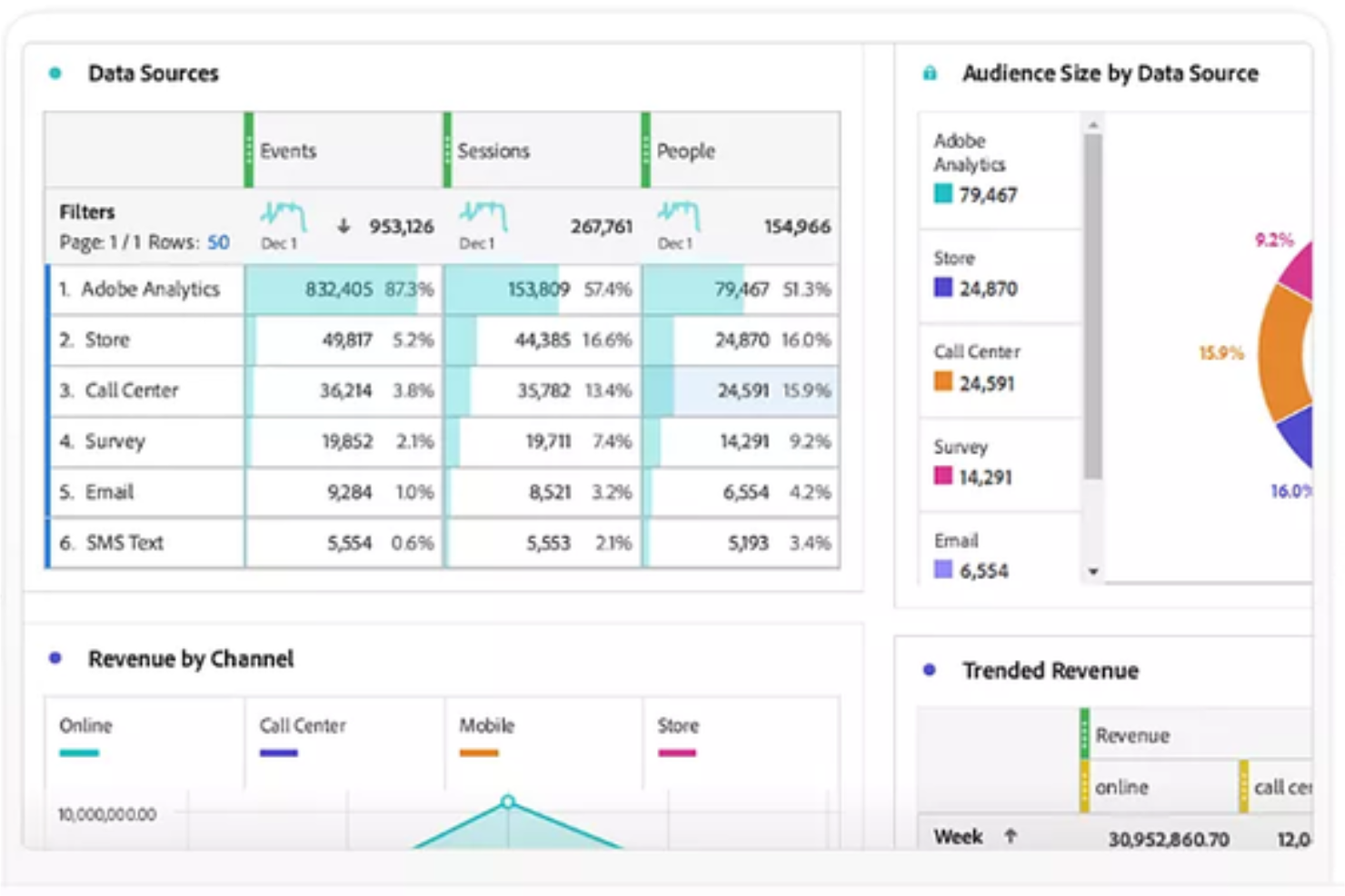
Adobe Customer Journey Analytics (CJA) is a specialized analytics platform that unifies datasets from web, mobile, and offline sources into one interface. It gives enterprise teams a way to unify and analyze customer interactions across every channel. If you need deeper journey insights and flexible data modeling than what you get with Power BI, this platform is built for you.
Who Is Adobe Customer Journey Analytics Best For?
Enterprise analytics teams in retail, finance, or travel who need to unify and analyze customer journeys across multiple digital and offline channels.
Why Adobe Customer Journey Analytics Is a Good Power BI alternative
I picked Adobe Customer Journey Analytics because it lets my team map and analyze customer journeys across every channel, not just digital touchpoints. With its omnichannel data stitching, I can see how users move from web to in-store to call center in a single view. I appreciate the way it visualizes complex, multi-step journeys that Power BI can’t natively handle. This gives us a much clearer picture of customer behavior across our entire business.
Adobe Customer Journey Analytics Key Features
- Identity stitching: Automatically merges various IDs, like cookies and email addresses, into a single person-centric profile.
- Analysis Workspace: A flexible workspace for building fallout and flow reports using drag-and-drop actions instead of SQL.
- Retroactive data processing: Lets you change data definitions or fix tracking errors without having to re-ingest or refresh the original dataset.
- Intelligent captions: Uses AI to write plain-text summaries of trends and anomalies to help non-technical users understand their data.
Adobe Customer Journey Analytics Integrations
Adobe Customer Journey Analytics offers native integrations across the Adobe Experience Cloud ecosystem, including Adobe Analytics, Adobe Audience Manager, and Adobe Target. It also provides an API for custom integrations and supports connections to external data sources through Adobe Experience Platform.
Pros and Cons
Pros:
- Integrates natively with Adobe Experience Cloud
- Role-based access controls for data governance
- Advanced segmentation for granular journey analysis
Cons:
- Fewer out-of-the-box visualizations than Power BI
- Steeper setup and configuration than Power BI
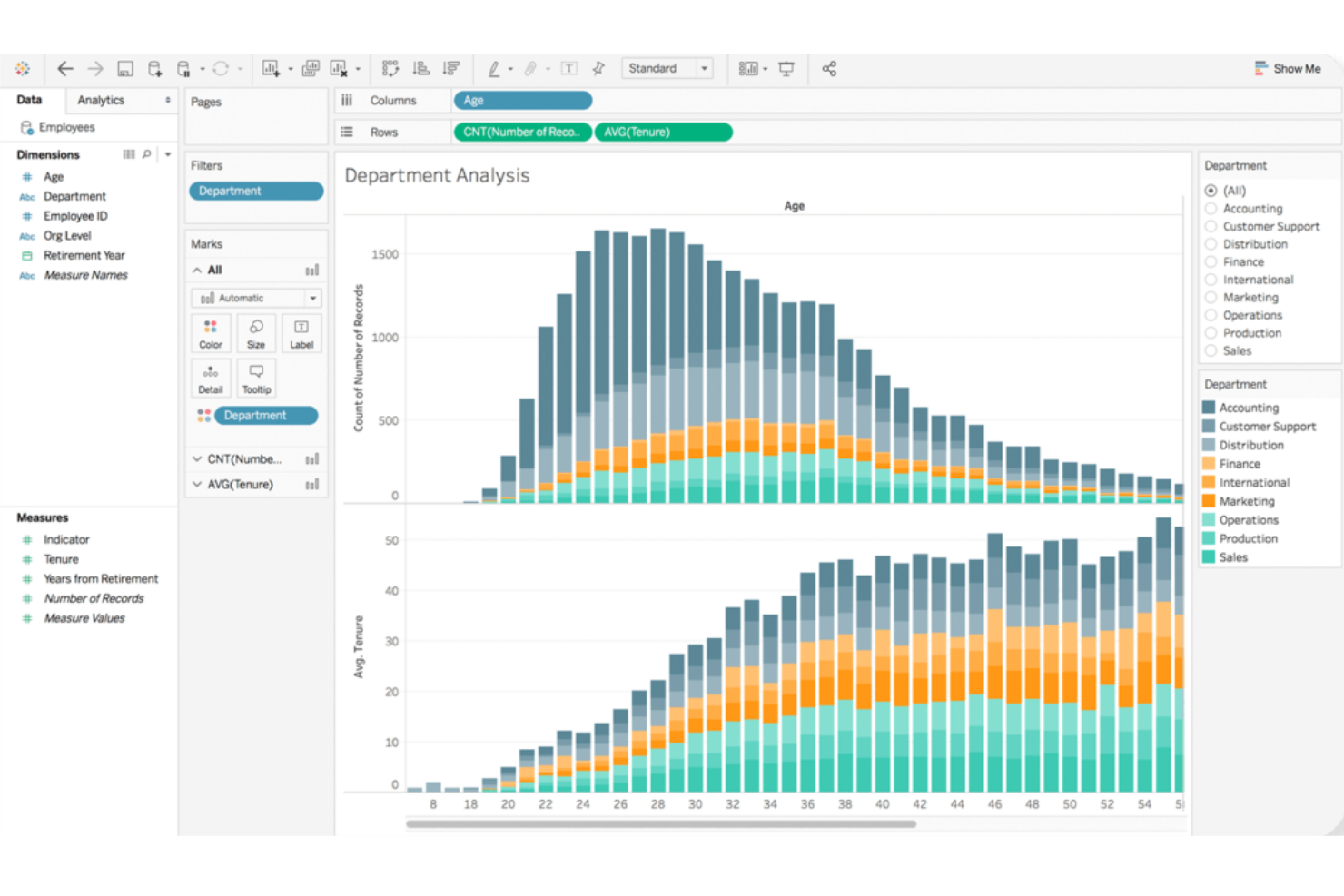
Tableau stands out for teams that need highly interactive and visual data exploration. It’s a strong fit for analysts and business users who want to dig into complex datasets and uncover insights through intuitive drag-and-drop dashboards. If your organization values flexible, visual storytelling with data, Tableau offers a different approach than Power BI’s more structured reporting style.
Why Tableau Is a Good Power BI Alternative
Tableau’s strength in interactive visual exploration makes it a top choice for teams that want to go beyond static dashboards. I picked Tableau for its ability to let users drill down into data, filter on the fly, and build custom visualizations with simple drag-and-drop actions. The platform’s VizQL engine translates user actions into queries, so you can instantly see changes reflected in your charts and graphs. This level of interactivity helps you uncover trends and outliers that might be missed with more rigid reporting tools like Power BI.
Tableau Key Features
Some other features in Tableau that may interest your team include:
- Data Prep with Tableau Prep: Prepare, clean, and shape your data visually before analysis using Tableau Prep’s dedicated interface.
- Live and In-Memory Data Connections: Connect to data in real time or use in-memory extracts for faster performance, depending on your needs.
- Collaboration and Sharing: Share dashboards securely with colleagues or stakeholders through Tableau Server or Tableau Cloud.
- Mobile-Optimized Dashboards: Design dashboards that automatically adjust for mobile devices, making insights accessible on the go.
Tableau Integrations
Integrations include Salesforce CRM, Google Analytics, Amazon Redshift, Snowflake, Microsoft SQL Server, Oracle, SAP HANA, Google BigQuery, Dropbox, and ServiceNow.
Pros and Cons
Pros:
- Handles large and complex datasets smoothly
- Strong support for advanced data visualizations
- Highly flexible drag-and-drop dashboard creation
Cons:
- Custom calculations can be complex to implement
- Steeper resource requirements for on-premises deployment

If your team needs to deliver highly customized analytics within your own products or portals, Looker is built for embedded analytics flexibility. It appeals to SaaS providers, product managers, and data teams who want to control the look, feel, and interactivity of analytics for end users. Unlike Power BI, Looker’s modeling layer and API-driven approach let you tailor data experiences and integrate analytics directly into your workflows.
Why Looker Is a Good Power BI Alternative
Looker stands out for teams that need to embed analytics directly into their own products or customer-facing portals. I picked Looker because its semantic modeling layer (LookML) lets you define and reuse business logic, making it easier to maintain consistent analytics across different environments.
API and developer tools allow you to customize dashboards, visualizations, and user experiences far beyond what Power BI typically offers for embedded use cases. This makes Looker a strong choice if you want to deliver tailored analytics that match your brand and workflow requirements.
Looker Key Features
Some other features in Looker that may be valuable for your team include:
- Scheduled Reporting: Automate report delivery to users or groups on a set schedule.
- Data Exploration Interface: Users can drill down, filter, and pivot data directly within dashboards.
- Row-Level Security: Control data access at a granular level for different users or groups.
- Version Control Integration: Manage LookML models and analytics assets using Git-based version control.
Looker Integrations
Integrations include BigQuery, Snowflake, Redshift, Databricks, Microsoft SQL Server, PostgreSQL, MySQL, Oracle, Google Sheets, and Salesforce.
Pros and Cons
Pros:
- Scheduled delivery of reports and dashboards
- Embedding options support deep product integration
- LookML enables reusable business logic modeling
Cons:
- Requires SQL knowledge for advanced modeling
- No native support for on-premises deployment
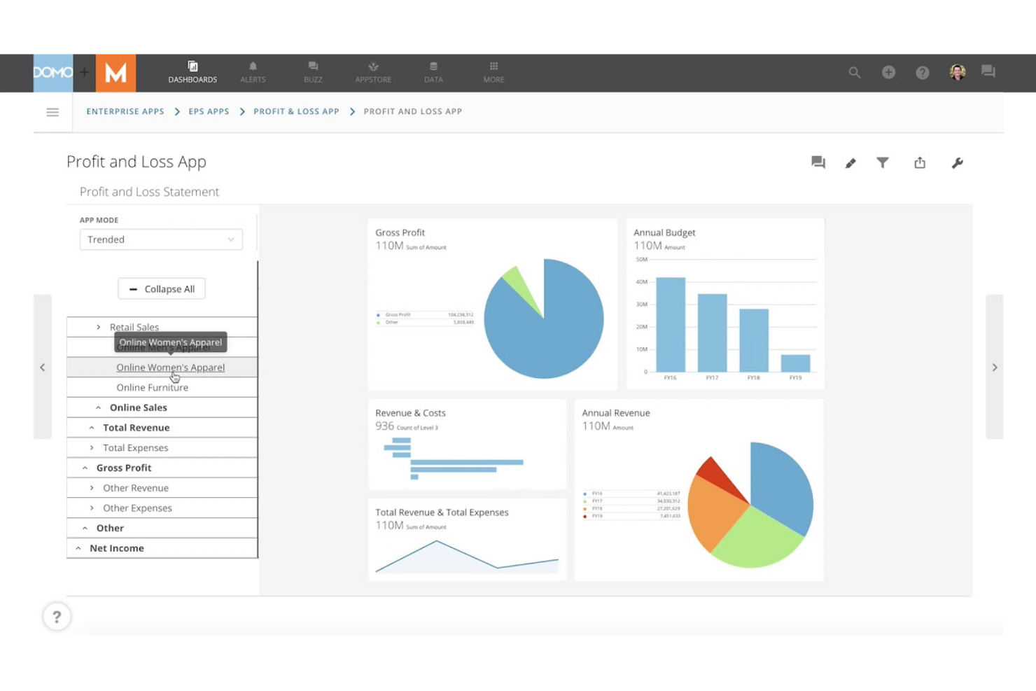
Domo is built for teams that need to share live dashboards and data updates across departments or locations. It’s especially useful for operations leaders, analysts, and executives who rely on up-to-the-minute insights to make fast decisions. Unlike Power BI, Domo emphasizes real-time data sharing and collaboration, so everyone stays aligned as soon as new information becomes available.
Why Domo Is a Good Power BI Alternative
If your team needs to share dashboards and data in real time, Domo is built for that exact purpose. I picked Domo because it lets you publish live dashboards that update instantly as new data flows in, so everyone sees the same numbers at the same time.
Domo also offers interactive sharing features, including customizable alerts and mobile access, which help keep distributed teams connected to the latest insights. This focus on real-time collaboration makes Domo a strong alternative to Power BI for organizations that can’t afford to wait for scheduled refreshes.
Domo Key Features
Some other features in Domo that may be valuable for your team include:
- App Creation Toolkit: Build custom data apps using drag-and-drop tools and prebuilt templates.
- Data Transformation (Magic ETL): Cleanse, join, and transform data visually without writing code.
- Data Governance Controls: Set detailed permissions and monitor data usage across your organization.
- Prebuilt Data Connectors: Connect to hundreds of data sources, including cloud apps, databases, and spreadsheets.
Domo Integrations
Integrations include Salesforce, Google Analytics, Facebook Ads, Twitter, Instagram, Shopify, HubSpot, Marketo, LinkedIn, and Microsoft Dynamics.
Pros and Cons
Pros:
- Mobile app supports on-the-go data access
- Magic ETL enables visual data transformation
- Real-time dashboard updates for instant visibility
Cons:
- Advanced analytics require separate add-ons
- Pricing is not transparent or publicly listed
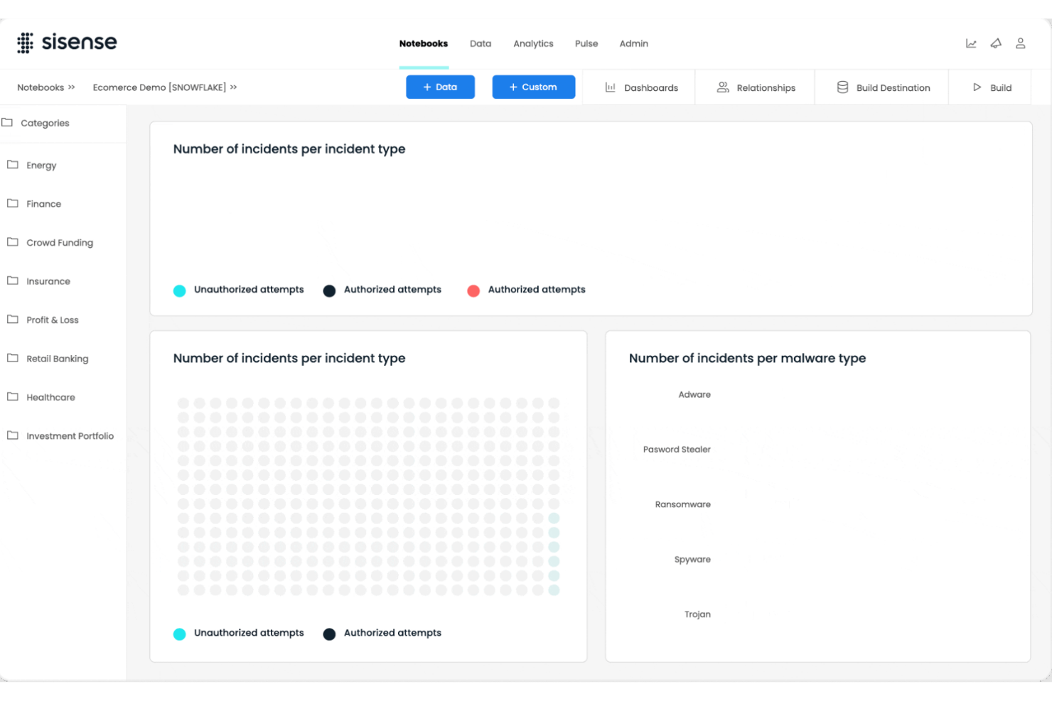
For teams handling data from many sources and formats, Sisense offers advanced capabilities for complex data integration. It’s a strong fit for data engineers, analytics leaders, and IT teams who need to blend, transform, and analyze large or disparate datasets. Unlike Power BI, Sisense’s in-chip technology and flexible data modeling help you unify and query data across cloud, on-premises, and hybrid environments without heavy pre-processing.
Why Sisense Is a Good Power BI Alternative
If your business needs to bring together data from a wide range of sources, Sisense is built for complex data integration scenarios. I picked Sisense because its Elasticube technology lets you blend and model data from cloud, on-premises, and hybrid environments without heavy data prep.
In-chip analytics engine processes large datasets quickly, supporting real-time analysis even when data is highly fragmented. This makes Sisense a strong choice for organizations that need to unify and analyze data from multiple, often incompatible, systems.
Sisense Key Features
Some other features in Sisense that may be useful for your team include:
- White-Labeling: Customize dashboards and analytics with your own branding and design elements.
- AI-Driven Insights: Use built-in AI features to surface trends and anomalies in your data automatically.
- Drag-and-Drop Dashboard Builder: Create interactive dashboards without writing code.
- Role-Based Access Controls: Set granular permissions for users and groups to manage data visibility and actions.
Sisense Integrations
Integrations include Snowflake, Amazon Redshift, Google BigQuery, Databricks, Azure Synapse, MySQL, PostgreSQL, Oracle, Microsoft SQL Server, and Salesforce.
Pros and Cons
Pros:
- In-chip processing accelerates dashboard performance
- White-labeling supports custom-branded analytics portals
- Handles large, complex datasets without lag
Cons:
- Limited visualization types compared to competitors
- Data model changes require full re-indexing
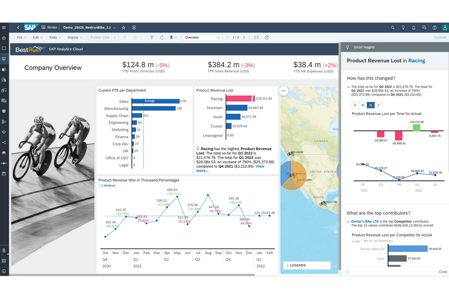
For organizations that need to connect analytics with enterprise planning, SAP Analytics Cloud offers a unified approach. Large enterprises and finance teams often choose it to align forecasting, budgeting, and reporting in one platform. Unlike Power BI, SAP Analytics Cloud brings planning, predictive analytics, and business intelligence together for end-to-end decision support.
Why SAP Analytics Cloud Is a Good Power BI Alternative
What sets SAP Analytics Cloud apart is its deep integration of analytics and enterprise planning in a single platform. I picked it for teams that need to connect financial planning, forecasting, and reporting without switching between multiple tools. The platform’s built-in planning workflows and predictive analytics help organizations align strategy and execution across departments. This makes SAP Analytics Cloud a strong choice for enterprises that want to unify business intelligence and planning in one environment.
SAP Analytics Cloud Key Features
Some other features in SAP Analytics Cloud that may be useful for your team include:
- Smart Insights: Automatically generate explanations for data trends and outliers.
- Live Data Connectivity: Connect directly to SAP and non-SAP data sources without data replication.
- Collaboration Tools: Comment, share, and assign tasks within reports and dashboards.
- Mobile Access: View and interact with dashboards on iOS and Android devices.
SAP Analytics Cloud Integrations
Integrations include SAP HANA, SAP S/4HANA, SAP BW/4HANA, SAP BusinessObjects solutions, SAP Business Planning and Consolidation, OData, and Google BigQuery.
Pros and Cons
Pros:
- Predictive analytics features for business users
- Native integration with SAP ERP systems
- Built-in enterprise planning and forecasting tools
Cons:
- Power BI Performance issues with large data volumes
- Limited visualization customization compared to
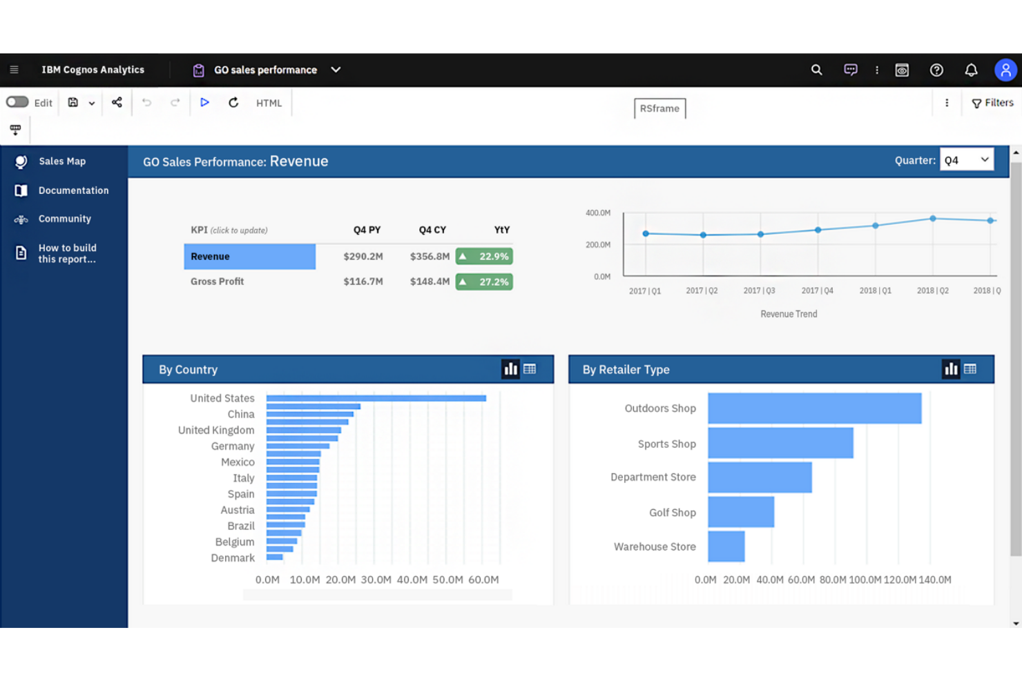
If you’re looking for a business intelligence platform with advanced AI-driven analytics, IBM Cognos Analytics is worth considering. It’s designed for organizations that want to uncover deeper insights from their data using automated data preparation and natural language querying. Unlike Power BI, IBM Cognos Analytics emphasizes AI-powered data discovery and guided analysis for users across business functions.
Why IBM Cognos Analytics Is a Good Power BI Alternative
IBM Cognos Analytics stands out for its AI-powered data insights, which go beyond what you’ll find in most business intelligence platforms. I picked it for teams that want automated data preparation and natural language querying to help users at any skill level uncover trends and patterns.
The platform’s AI Assistant can generate visualizations and suggest insights based on your questions, making data exploration more accessible. This focus on embedded AI and guided analysis makes IBM Cognos Analytics a strong alternative to Power BI for organizations that want to leverage advanced analytics without heavy manual effort.
IBM Cognos Analytics Key Features
Some other features in IBM Cognos Analytics that may be valuable for your team include:
- Data Modeling Tools: Build and manage data models directly within the platform.
- Custom Dashboard Creation: Design interactive dashboards with drag-and-drop components.
- Scheduled Reporting: Automate report generation and delivery on a set schedule.
- Geospatial Analytics: Visualize and analyze data using integrated mapping tools.
IBM Cognos Analytics Integrations
Integrations include IBM Planning Analytics, IBM SPSS Statistics, IBM watsonx, Microsoft Fabric, SAP BW/4HANA, Amazon Web Services, Microsoft Azure, Google Cloud Platform, and Slack.
Pros and Cons
Pros:
- Scheduled reporting automates recurring report delivery
- Built-in data modeling for complex datasets
- AI Assistant generates insights from natural language
Cons:
- Data preparation tools require technical knowledge
- Dashboard design options are less flexible
If your team needs to deliver highly customized analytics within your own products or portals, Looker is built for embedded analytics flexibility. It appeals to SaaS providers, product managers, and data teams who want to control the look, feel, and interactivity of analytics for end users. Unlike Power BI, Looker’s modeling layer and API-driven approach let you tailor data experiences and integrate analytics directly into your workflows.
Why Looker Is a Good Power BI Alternative
Looker stands out for teams that need to embed analytics directly into their own products or customer-facing portals. I picked Looker because its semantic modeling layer (LookML) lets you define and reuse business logic, making it easier to maintain consistent analytics across different environments.
API and developer tools allow you to customize dashboards, visualizations, and user experiences far beyond what Power BI typically offers for embedded use cases. This makes Looker a strong choice if you want to deliver tailored analytics that match your brand and workflow requirements.
Looker Key Features
Some other features in Looker that may be valuable for your team include:
- Scheduled Reporting: Automate report delivery to users or groups on a set schedule.
- Data Exploration Interface: Users can drill down, filter, and pivot data directly within dashboards.
- Row-Level Security: Control data access at a granular level for different users or groups.
- Version Control Integration: Manage LookML models and analytics assets using Git-based version control.
Looker Integrations
Integrations include BigQuery, Snowflake, Redshift, Databricks, Microsoft SQL Server, PostgreSQL, MySQL, Oracle, Google Sheets, and Salesforce.
Pros and Cons
Pros:
- Scheduled delivery of reports and dashboards
- Embedding options support deep product integration
- LookML enables reusable business logic modeling
Cons:
- Requires SQL knowledge for advanced modeling
- No native support for on-premises deployment
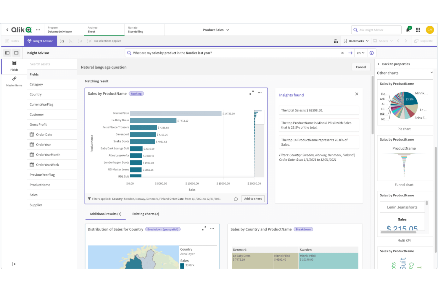
Qlik Sense is designed for teams that need to explore complex, interconnected data from multiple sources. Its associative data modeling engine lets users freely navigate relationships in their data, making it easier to spot hidden patterns and connections. If your business relies on flexible, in-depth analysis across diverse datasets, Qlik Sense offers a unique approach compared to Power BI’s more linear data exploration.
Why Qlik Sense Is a Good Power BI Alternative
What sets Qlik Sense apart is its associative data modeling, which lets you explore data relationships without being limited to predefined hierarchies. I picked Qlik Sense because its engine allows users to click on any data point and instantly see related and unrelated data, making it easier to uncover insights that might be missed in more linear tools like Power BI.
The platform’s interactive selection and filtering features help you follow your own analysis path, rather than sticking to a set drill-down structure. This approach is especially valuable for teams that need to analyze complex, multi-source data and want the freedom to investigate connections as they go.
Qlik Sense Key Features
Some other features in Qlik Sense that may be useful for your team include:
- Self-Service Data Visualization: Users can create and customize their own dashboards and reports without IT support.
- Augmented Analytics: Built-in AI and machine learning capabilities assist with data insights and suggestions.
- Multi-Cloud Deployment: Deploy Qlik Sense on-premises, in a private cloud, or through Qlik Cloud for flexible infrastructure options.
- Data Alerts: Set up automated alerts to notify users when data meets specific conditions or thresholds.
Qlik Sense Integrations
Integrations include Amazon Web Services, Google Cloud, Microsoft Azure, Snowflake, SAP, Databricks, Cloudera, Salesforce, Oracle, and Dropbox.
Pros and Cons
Pros:
- Strong data governance and security controls
- Multi-cloud deployment options for flexible hosting
- Built-in AI assists with data insights
Cons:
- Fewer pre-built templates than Power BI
- Scripting language differs from SQL standards
Open-source flexibility makes Metabase a strong fit for teams that want full control over their analytics environment. Data engineers, IT teams, and organizations with strict data privacy needs often choose it for its self-hosting options and transparent codebase. Unlike Power BI, Metabase lets you deploy on your own infrastructure and customize the platform to match your security and compliance requirements.
Why Metabase Is a Good Power BI Alternative
If you need a business intelligence platform that supports open-source deployment, Metabase is worth considering. I picked it because you can self-host the platform, giving your team full control over data storage, access, and security. Metabase’s open-source codebase also allows for custom modifications, so you can tailor the platform to your organization’s unique requirements. This flexibility is especially valuable for businesses with strict compliance or privacy standards that can’t be met by cloud-only solutions like Power BI.
Metabase Key Features
Some other features in Metabase that may be useful for your team include:
- No-Code Query Builder: Create custom queries and visualizations without writing SQL.
- Automated Dashboard Subscriptions: Schedule dashboards to be sent to users by email or Slack.
- Interactive Data Filtering: Add filters to dashboards so viewers can explore data by segment or timeframe.
- Audit Logging: Track user activity and changes within the platform for compliance and oversight.
Metabase Integrations
Integrations include Amazon Athena, Amazon Redshift, BigQuery, ClickHouse, Databricks, Druid, Google Sheets, MariaDB, Microsoft SQL Server, and MongoDB.
Pros and Cons
Pros:
- No-code query builder for non-technical users
- Open-source codebase allows custom modifications
- Self-hosting supports strict data privacy needs
Cons:
- Embedding dashboards needs additional configuration
- No built-in support for R or Python
Altre alternative a Power BI
Ecco alcune ulteriori alternative a Power BI che non sono rientrate nella mia selezione principale, ma che meritano comunque una valutazione:
- Zoho Analytics
For automated report scheduling
- Strategy
For scalable enterprise reporting
- GoodData
With white-label analytics delivery
- Infor Birst
For networked data architecture


Criteri di selezione delle alternative a Power BI
Nella scelta delle migliori alternative a Power BI da includere in questa lista, ho valutato le comuni esigenze e criticità degli acquirenti in relazione ai prodotti di business intelligence e piattaforme di analisi dati, come la possibilità per utenti non tecnici di accedere agli insight e il supporto per la modellazione complessa dei dati. Ho utilizzato anche il seguente schema per mantenere la mia valutazione strutturata ed equa:
Funzionalità principali (25% del punteggio totale)
Per essere incluse in questa lista, ciascuna soluzione doveva rispondere a queste esigenze comuni:
- Collegarsi a fonti dati multiple
- Creare dashboard e report interattivi
- Visualizzare i dati con grafici e diagrammi
- Pianificare e automatizzare la consegna dei report
- Supportare filtri sui dati e drill-down
Funzionalità distintive aggiuntive (25% del punteggio totale)
Per restringere ulteriormente il campo dei concorrenti, ho anche cercato funzionalità uniche, come:
- Analisi dei dati e approfondimenti supportati dall'IA
- Capacità di query in linguaggio naturale
- Analisi integrate per applicazioni di terze parti
- Strumenti avanzati di mappatura geospaziale
- Controllo delle versioni per report e dashboard
Usabilità (10% del punteggio totale)
Per valutare l'usabilità di ciascun sistema, ho preso in considerazione i seguenti aspetti:
- Dashboard e report builder intuitivi
- Interfaccia pulita e dal design moderno
- Layout dell'area di lavoro personalizzabili
- Prestazioni reattive con grandi set di dati
- Accessibilità per utenti con diversi livelli di competenza
Onboarding (10% del punteggio totale)
Per valutare l'esperienza di onboarding di ciascuna piattaforma, ho considerato i seguenti aspetti:
- Disponibilità di tour guidati passo passo del prodotto
- Accesso a video formativi e documentazione
- Modelli predefiniti di dashboard e report
- Chatbot o aiuto guidato all'interno dell'app
- Webinar di onboarding in diretta o on-demand
Assistenza clienti (10% del punteggio totale)
Per valutare i servizi di assistenza clienti di ogni fornitore software, ho preso in esame i seguenti aspetti:
- Disponibilità di supporto 24/7
- Canali di assistenza multipli come chat, email e telefono
- Accesso a una base di conoscenza consultabile
- Forum della community per supporto tra pari
- Tempi di risposta rapidi per problemi tecnici
Rapporto qualità/prezzo (10% del punteggio totale)
Per valutare il rapporto qualità/prezzo di ciascuna piattaforma, ho preso in considerazione i seguenti criteri:
- Piani tariffari trasparenti e flessibili
- Disponibilità di prova gratuita o demo
- Funzionalità incluse in ogni fascia di prezzo
- Costi rispetto a strumenti simili
- Sconti per abbonamenti annuali o su grandi volumi
Recensioni dei clienti (10% del punteggio totale)
Per avere un'idea della soddisfazione complessiva dei clienti, ho considerato i seguenti elementi durante la lettura delle recensioni:
- Coerenza dei feedback positivi tra diverse fonti
- Affidabilità dichiarata e tempo di attività (uptime)
- Qualità delle esperienze di assistenza clienti
- Frequenza degli aggiornamenti e delle nuove funzionalità
- Esempi concreti di impatto aziendale
Perché Cercare un'Alternativa a Power BI?
Anche se Power BI è uno degli strumenti di analisi più usati, alcuni acquirenti software cercano alternative che si adattino meglio ai loro flussi di lavoro, esigenze tecniche o budget. Potresti valutare altre opzioni perché…
- Vuoi un’interfaccia più user-friendly che offra analisi dei dati avanzate e sia più semplice per utenti non tecnici
- Hai bisogno di un’interfaccia più semplice con funzionalità di drag and drop per creare dashboard più rapidamente
- Il tuo team desidera funzionalità avanzate e opzioni di personalizzazione senza necessariamente avere competenze tecniche elevate
- Stai cercando strumenti di analisi più convenienti per team in crescita
- Hai bisogno di un supporto migliore per connettere e analizzare dati provenienti da diverse fonti
- Vuoi un accesso più rapido agli insight in tempo reale senza configurazioni complesse
- La tua organizzazione necessita di una soluzione facilmente scalabile a livello aziendale
Se ti riconosci in uno di questi casi, questa lista mette in evidenza diverse alternative valide che offrono capacità analitiche flessibili, flussi di lavoro più semplici e una migliore corrispondenza con differenti esigenze aziendali.
Funzionalità Principali di Power BI
Ecco alcune delle principali funzionalità di Power BI, così da aiutarti a confrontare le soluzioni alternative:
- Creazione interattiva di dashboard e report
- Integrazione con servizi Microsoft 365 e Azure
- Strumenti per la modellazione e trasformazione dei dati
- Streaming e monitoraggio dei dati in tempo reale
- Query in linguaggio naturale con funzionalità Q&A
- Consegna programmata e automatica dei report
- Marketplace di visualizzazioni personalizzate
- App mobile per accesso in mobilità
- Sicurezza a livello di riga per la governance dei dati
- Collaborazione e condivisione all'interno di Microsoft Teams
E adesso?
Se stai cercando alternative a Power BI, collegati con un consulente SoftwareSelect per ricevere raccomandazioni gratuite.
Compili un modulo e fai una breve chiacchierata in cui approfondiscono i tuoi bisogni specifici. Riceverai quindi una lista selezionata di software da valutare. Ti supporteranno anche durante tutto il processo di acquisto, comprese le trattative sul prezzo.