10 alternativas a Power BI seleccionadas para 2026

10 Lista corta de las mejores alternativas a Power BI


Una buena alternativa a Power BI ofrece a tu equipo modelos de datos flexibles, tableros interactivos e integración fiable con tus fuentes de datos existentes. Si buscas opciones más allá de Power BI, probablemente necesitas una plataforma de inteligencia empresarial que se adapte a tus requisitos de informes, que respalde tus flujos de trabajo y que se ajuste a la escala de tu organización.
Esta lista te ayudará a comparar las principales alternativas a Power BI, resaltando en qué destaca cada herramienta para que puedas tomar una decisión informada para tu estrategia de análisis.
¿Qué es Power BI?
Power BI es una herramienta de inteligencia empresarial de Microsoft que ayuda a las organizaciones a visualizar, analizar y compartir información basada en datos. Se conecta a diversas fuentes de datos, permitiendo a los usuarios crear tableros e informes que facilitan la toma de decisiones en la nube. Power BI es ampliamente utilizado por analistas, equipos de datos y líderes empresariales que necesitan sólidas capacidades analíticas e insights en tiempo real para monitorizar el rendimiento e identificar tendencias.
La plataforma incluye funciones avanzadas para el modelado y la transformación de datos, pero algunos usuarios pueden encontrar una curva de aprendizaje pronunciada al enfrentarse a flujos de trabajo más complejos. Aunque ofrece una interfaz fácil de usar para informes básicos, ciertos casos de uso aún requieren conocimientos técnicos, especialmente a nivel empresarial.
Resumen de las mejores alternativas a Power BI
Esta tabla comparativa resume los detalles de precios de mis principales alternativas a Power BI para ayudarte a encontrar la mejor opción para tu presupuesto y las necesidades de tu empresa.
| Tool | Best For | Trial Info | Price | ||
|---|---|---|---|---|---|
| 1 | Ideal para el seguimiento de clientes en múltiples canales | Plan gratuito + demo gratuita disponible | Precio a consultar | Website | |
| 2 | Ideal para compartir paneles en tiempo real | Prueba gratuita de 30 días + demo gratis disponible | Precios a solicitud | Website | |
| 3 | Ideal para integración de datos compleja | Prueba gratuita de 7 días + demostración gratuita disponible | Precio a consultar | Website | |
| 4 | Ideal para la alineación de la planificación empresarial | Demo gratuita disponible | Precios disponibles bajo solicitud | Website | |
| 5 | Ideal para información de datos impulsada por IA | Prueba gratuita de 30 días disponible | Desde $11.25/usuario/mes | Website | |
| 6 | Ideal para personalización de analítica embebida | Plan gratuito disponible | Precio bajo solicitud | Website | |
| 7 | Ideal para modelado de datos asociativo | Prueba gratuita disponible | Desde $300/10 usuarios/mes (facturado anualmente) | Website | |
| 8 | Ideal para flexibilidad en despliegue de código abierto | Plan gratuito disponible | Desde $90/mes (facturado anualmente) | Website | |
| 9 | Ideal para programación automática de reportes | Prueba gratuita de 15 días + plan gratuito + demo gratis disponible | Desde $24/mes (facturado anualmente) | Website | |
| 10 | Mejor para informes empresariales escalables | Prueba gratuita de 14 días + demo gratuita disponible | Desde $13/usuario/mes | Website |
Por Qué Confiar en Nuestras Reseñas de Software
Llevamos probando y revisando software desde 2020. Como líderes de CX, sabemos lo crítico y difícil que es tomar la decisión correcta al seleccionar software. Invertimos en investigación a fondo para que nuestra audiencia tome mejores decisiones de compra de software. Hemos probado más de 2,000 herramientas para distintos casos de uso de CX y escrito más de 1,000 reseñas integrales de software. Descubre cómo mantenemos la transparencia y nuestra metodología para reseñas de software.
-

SupportYourApp
Visit WebsiteThis is an aggregated rating for this tool including ratings from Crozdesk users and ratings from other sites.4.7 -
Tidio
Visit WebsiteThis is an aggregated rating for this tool including ratings from Crozdesk users and ratings from other sites.4.7 -
Freshdesk
Visit WebsiteThis is an aggregated rating for this tool including ratings from Crozdesk users and ratings from other sites.4.4


Reseñas de alternativas a Power BI
A continuación presento mis análisis detallados de las mejores alternativas a Power BI que llegaron a mi lista corta. Mis reseñas ofrecen un análisis exhaustivo de las características, integraciones y mejores casos de uso de cada plataforma para ayudarte a encontrar la adecuada para ti.
Ideal para el seguimiento de clientes en múltiples canales
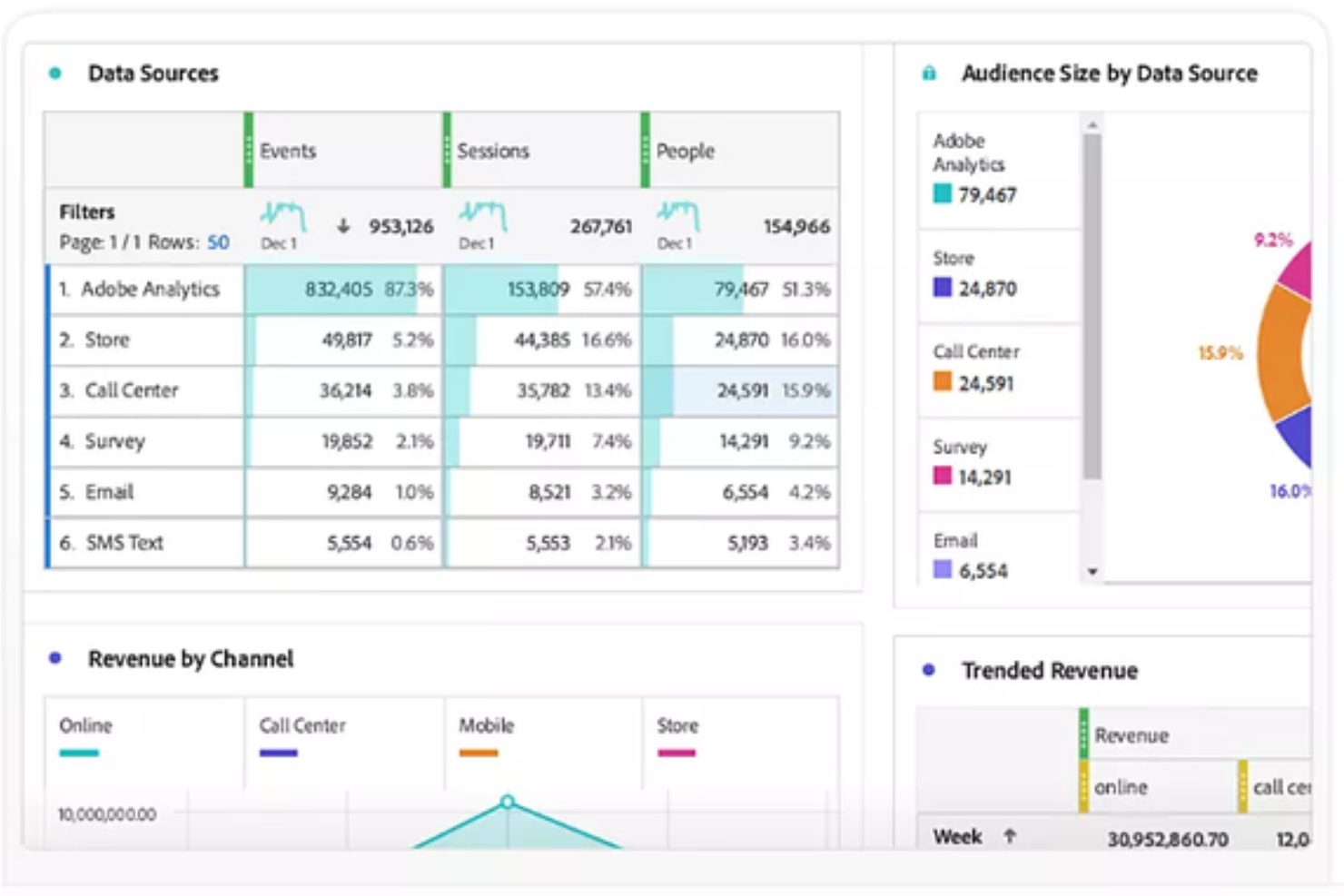
Adobe Customer Journey Analytics (CJA) es una plataforma de análisis especializada que unifica conjuntos de datos de la web, dispositivos móviles y fuentes offline en una sola interfaz. Ofrece a los equipos empresariales una forma de unificar y analizar las interacciones de los clientes a través de todos los canales. Si necesitas conocimientos más profundos sobre el recorrido del cliente y una modelización de datos más flexible de la que obtienes con Power BI, esta plataforma está diseñada para ti.
¿Para quién es Adobe Customer Journey Analytics?
Equipos de análisis empresarial en retail, finanzas o viajes que necesiten unificar y analizar los recorridos de clientes a través de múltiples canales digitales y offline.
Por qué Adobe Customer Journey Analytics es una buena alternativa a Power BI
Elegí Adobe Customer Journey Analytics porque me permite a mi equipo mapear y analizar los recorridos de clientes en todos los canales, no solo en puntos digitales. Con su unificación de datos omnicanal, puedo ver cómo los usuarios pasan de la web a la tienda física o al centro de llamadas en una sola vista. Valoro mucho la manera en que visualiza recorridos complejos y de múltiples pasos que Power BI no puede manejar de forma nativa. Esto nos brinda una imagen mucho más clara del comportamiento del cliente en todo nuestro negocio.
Características clave de Adobe Customer Journey Analytics
- Unificación de identidades: Fusiona automáticamente diferentes ID, como cookies y direcciones de correo electrónico, en un único perfil centrado en la persona.
- Analysis Workspace: Un espacio de trabajo flexible para crear informes de abandono y de flujo utilizando acciones de arrastrar y soltar en lugar de SQL.
- Procesamiento de datos retroactivo: Permite cambiar definiciones de datos o corregir errores de seguimiento sin tener que reingestar ni actualizar el conjunto de datos original.
- Subtítulos inteligentes: Usa inteligencia artificial para redactar resúmenes en texto sencillo sobre tendencias y anomalías, ayudando a usuarios no técnicos a comprender sus datos.
Integraciones de Adobe Customer Journey Analytics
Adobe Customer Journey Analytics ofrece integraciones nativas en todo el ecosistema de Adobe Experience Cloud, incluyendo Adobe Analytics, Adobe Audience Manager y Adobe Target. También proporciona una API para integraciones personalizadas y admite conexiones con fuentes de datos externas a través de Adobe Experience Platform.
Pros and Cons
Pros:
- Segmentación avanzada para análisis detallados de recorridos
- Controles de acceso basados en roles para la gobernanza de datos
- Integración nativa con Adobe Experience Cloud
Cons:
- Configuración e implementación más complejas que en Power BI
- Menos visualizaciones prediseñadas que Power BI
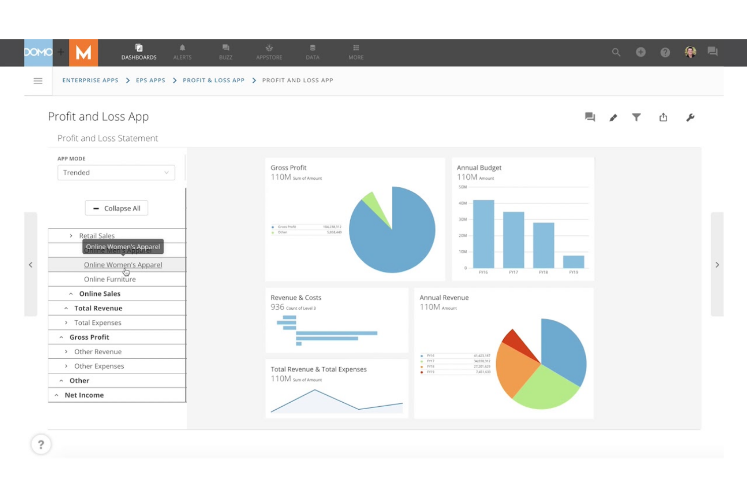
Domo está diseñado para equipos que necesitan compartir paneles en vivo y actualizaciones de datos entre departamentos o ubicaciones. Es especialmente útil para líderes de operaciones, analistas y ejecutivos que dependen de información actualizada al minuto para tomar decisiones rápidas. A diferencia de Power BI, Domo enfatiza la colaboración y el intercambio de datos en tiempo real, para que todos estén alineados tan pronto como haya nueva información disponible.
Por qué Domo es una buena alternativa a Power BI
Si tu equipo necesita compartir paneles y datos en tiempo real, Domo está hecho para exactamente ese propósito. Elegí Domo porque permite publicar paneles en vivo que se actualizan al instante a medida que llegan nuevos datos, por lo que todos ven los mismos números al mismo tiempo.
Domo también ofrece funciones interactivas de intercambio, incluyendo alertas personalizables y acceso móvil, lo que ayuda a mantener a los equipos distribuidos conectados con los últimos datos. Este enfoque en la colaboración en tiempo real convierte a Domo en una sólida alternativa a Power BI para organizaciones que no pueden esperar los refrescos programados.
Características clave de Domo
Otras características de Domo que pueden ser valiosas para tu equipo incluyen:
- Kit de herramientas para crear aplicaciones: Crea aplicaciones de datos personalizadas usando herramientas de arrastrar y soltar y plantillas preconstruidas.
- Transformación de datos (Magic ETL): Limpia, une y transforma datos de forma visual sin necesidad de programar código.
- Controles de gobernanza de datos: Establece permisos detallados y monitorea el uso de datos en toda tu organización.
- Conectores de datos preconstruidos: Conéctate a cientos de fuentes de datos, incluyendo aplicaciones en la nube, bases de datos y hojas de cálculo.
Integraciones de Domo
Las integraciones incluyen Salesforce, Google Analytics, Facebook Ads, Twitter, Instagram, Shopify, HubSpot, Marketo, LinkedIn y Microsoft Dynamics.
Pros and Cons
Pros:
- Actualizaciones en tiempo real en los paneles para visibilidad instantánea
- Magic ETL permite la transformación visual de datos
- La aplicación móvil permite acceso a los datos en cualquier lugar
Cons:
- Los precios no son transparentes ni están publicados públicamente
- Las analíticas avanzadas requieren complementos adicionales

Para equipos que manejan datos de muchas fuentes y formatos, Sisense ofrece capacidades avanzadas para una integración de datos compleja. Es una excelente opción para ingenieros de datos, líderes de analítica y equipos de TI que necesitan combinar, transformar y analizar conjuntos de datos grandes o dispares. A diferencia de Power BI, la tecnología in-chip de Sisense y su modelado de datos flexible te ayudan a unificar y consultar datos en la nube, en local y en entornos híbridos sin necesidad de un preprocesamiento intensivo.
Por Qué Sisense Es una Buena Alternativa a Power BI
Si tu empresa necesita reunir datos de un amplio rango de fuentes, Sisense está diseñado para escenarios complejos de integración de datos. Elegí Sisense porque su tecnología Elasticube te permite combinar y modelar datos de entornos en la nube, locales e híbridos sin una preparación de datos pesada.
El motor de análisis in-chip procesa rápidamente grandes volúmenes de datos, soportando análisis en tiempo real incluso cuando los datos están muy fragmentados. Esto convierte a Sisense en una excelente elección para organizaciones que necesitan unificar y analizar datos de sistemas múltiples que, a menudo, son incompatibles entre sí.
Características Clave de Sisense
Otras características de Sisense que pueden ser útiles para tu equipo incluyen:
- Etiquetado blanco (White-Labeling): Personaliza paneles y análisis con tu propia marca e identidad visual.
- Información Impulsada por IA: Utiliza funciones integradas de IA para detectar automáticamente tendencias y anomalías en tus datos.
- Constructor de Dashboards con Arrastrar y Soltar: Crea paneles interactivos sin escribir código.
- Controles de Acceso Basados en Roles: Configura permisos detallados para usuarios y grupos para gestionar la visibilidad y acciones sobre los datos.
Integraciones de Sisense
Las integraciones incluyen Snowflake, Amazon Redshift, Google BigQuery, Databricks, Azure Synapse, MySQL, PostgreSQL, Oracle, Microsoft SQL Server y Salesforce.
Pros and Cons
Pros:
- Maneja conjuntos de datos grandes y complejos sin demoras
- El etiquetado blanco permite portales analíticos personalizados
- El procesamiento in-chip acelera el rendimiento de los paneles
Cons:
- Los cambios en el modelo de datos requieren un reindexado completo
- Tipos de visualización limitados en comparación con la competencia
Ideal para la alineación de la planificación empresarial
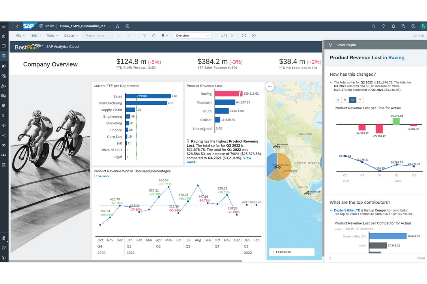
Para las organizaciones que necesitan conectar análisis con la planificación empresarial, SAP Analytics Cloud ofrece un enfoque unificado. Las grandes empresas y los equipos financieros suelen elegirlo para alinear la previsión, el presupuesto y la elaboración de informes en una sola plataforma. A diferencia de Power BI, SAP Analytics Cloud reúne la planificación, el análisis predictivo y la inteligencia empresarial para brindar soporte integral a la toma de decisiones.
Por qué SAP Analytics Cloud es una buena alternativa a Power BI
Lo que diferencia a SAP Analytics Cloud es su profunda integración del análisis y la planificación empresarial en una sola plataforma. Lo elegí para los equipos que necesitan conectar la planificación financiera, la previsión y los informes sin cambiar entre varias herramientas. Los flujos de trabajo de planificación integrados y el análisis predictivo de la plataforma ayudan a las organizaciones a alinear la estrategia y la ejecución entre departamentos. Esto convierte a SAP Analytics Cloud en una excelente opción para las empresas que desean unificar la inteligencia empresarial y la planificación en un solo entorno.
Características clave de SAP Analytics Cloud
Otras funciones de SAP Analytics Cloud que pueden ser útiles para tu equipo incluyen:
- Smart Insights: Genera automáticamente explicaciones sobre tendencias y valores atípicos en los datos.
- Conectividad de datos en vivo: Conéctate directamente a fuentes de datos SAP y no SAP sin replicación de datos.
- Herramientas de colaboración: Comenta, comparte y asigna tareas dentro de informes y paneles.
- Acceso móvil: Visualiza e interactúa con los paneles en dispositivos iOS y Android.
Integraciones de SAP Analytics Cloud
Las integraciones incluyen SAP HANA, SAP S/4HANA, SAP BW/4HANA, las soluciones SAP BusinessObjects, SAP Business Planning and Consolidation, OData y Google BigQuery.
Pros and Cons
Pros:
- Herramientas de planificación y previsión integradas
- Integración nativa con sistemas SAP ERP
- Funciones de análisis predictivo para usuarios empresariales
Cons:
- Personalización limitada de visualizaciones en comparación con
- Problemas de rendimiento con grandes volúmenes de datos en comparación con Power BI
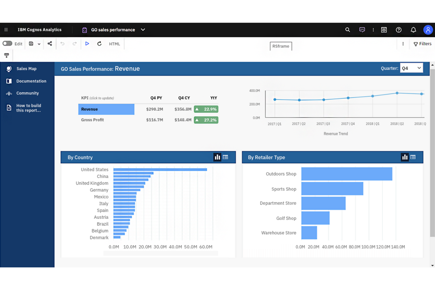
Si buscas una plataforma de inteligencia empresarial con análisis avanzados impulsados por IA, IBM Cognos Analytics vale la pena considerar. Está diseñada para organizaciones que desean descubrir conocimientos más profundos de sus datos utilizando preparación de datos automatizada y consultas en lenguaje natural. A diferencia de Power BI, IBM Cognos Analytics enfatiza el descubrimiento de datos con IA y el análisis guiado para usuarios en todas las áreas del negocio.
Por qué IBM Cognos Analytics es una buena alternativa a Power BI
IBM Cognos Analytics se destaca por sus análisis de datos impulsados por IA, que van más allá de lo que encontrarás en la mayoría de las plataformas de inteligencia empresarial. Lo elegí para equipos que desean preparación de datos automatizada y consultas en lenguaje natural para ayudar a los usuarios de cualquier nivel a detectar tendencias y patrones.
El Asistente de IA de la plataforma puede generar visualizaciones y sugerir conocimientos en función de tus preguntas, facilitando la exploración de datos. Este enfoque en IA integrada y análisis guiado convierte a IBM Cognos Analytics en una sólida alternativa a Power BI para organizaciones que quieren aprovechar análisis avanzados sin esfuerzo manual intensivo.
Características clave de IBM Cognos Analytics
Otras características de IBM Cognos Analytics que pueden ser valiosas para tu equipo incluyen:
- Herramientas de modelado de datos: Crea y gestiona modelos de datos directamente en la plataforma.
- Creación personalizada de paneles: Diseña paneles interactivos con componentes de arrastrar y soltar.
- Informes programados: Automatiza la generación y entrega de informes con una programación definida.
- Análisis geoespacial: Visualiza y analiza datos utilizando herramientas de mapeo integradas.
Integraciones de IBM Cognos Analytics
Las integraciones incluyen IBM Planning Analytics, IBM SPSS Statistics, IBM watsonx, Microsoft Fabric, SAP BW/4HANA, Amazon Web Services, Microsoft Azure, Google Cloud Platform y Slack.
Pros and Cons
Pros:
- El Asistente de IA genera conocimientos a partir de lenguaje natural
- Modelado de datos integrado para conjuntos de datos complejos
- La generación de informes programados automatiza la entrega recurrente de reportes
Cons:
- Las opciones de diseño de paneles son menos flexibles
- Las herramientas de preparación de datos requieren conocimientos técnicos

Si tu equipo necesita ofrecer análisis altamente personalizados dentro de tus propios productos o portales, Looker está diseñado para brindar flexibilidad en la analítica embebida. Es ideal para proveedores SaaS, gerentes de producto y equipos de datos que desean controlar el aspecto, la sensación e interactividad de los análisis para los usuarios finales. A diferencia de Power BI, la capa de modelado de Looker y su enfoque basado en API te permiten personalizar las experiencias de datos e integrar la analítica directamente en tus flujos de trabajo.
Por qué Looker es una buena alternativa a Power BI
Looker se destaca para equipos que necesitan incrustar análisis directamente en sus propios productos o portales de cara al cliente. Elegí Looker porque su capa semántica de modelado (LookML) te permite definir y reutilizar lógica de negocio, facilitando el mantenimiento de análisis consistentes en diferentes entornos.
Las herramientas para desarrolladores y la API permiten personalizar tableros, visualizaciones y experiencias de usuario mucho más allá de lo que Power BI suele ofrecer para escenarios embebidos. Esto convierte a Looker en una excelente opción si deseas entregar analítica adaptada a tu marca y a los requisitos de tus flujos de trabajo.
Funciones clave de Looker
Otras funciones de Looker que pueden ser valiosas para tu equipo incluyen:
- Informes programados: Automatiza la entrega de informes a usuarios o grupos en un horario definido.
- Interfaz para exploración de datos: Los usuarios pueden profundizar, filtrar y hacer tablas dinámicas directamente en los tableros.
- Seguridad a nivel de fila: Controla el acceso a los datos de forma granular para diferentes usuarios o grupos.
- Integración con control de versiones: Administra modelos LookML y activos analíticos usando control de versiones basado en Git.
Integraciones de Looker
Las integraciones incluyen BigQuery, Snowflake, Redshift, Databricks, Microsoft SQL Server, PostgreSQL, MySQL, Oracle, Google Sheets y Salesforce.
Pros and Cons
Pros:
- LookML permite modelar lógica de negocio reutilizable
- Opciones de integración embebida que soportan integración profunda en productos
- Entrega programada de informes y tableros
Cons:
- Sin soporte nativo para despliegues locales
- Requiere conocimientos de SQL para modelado avanzado
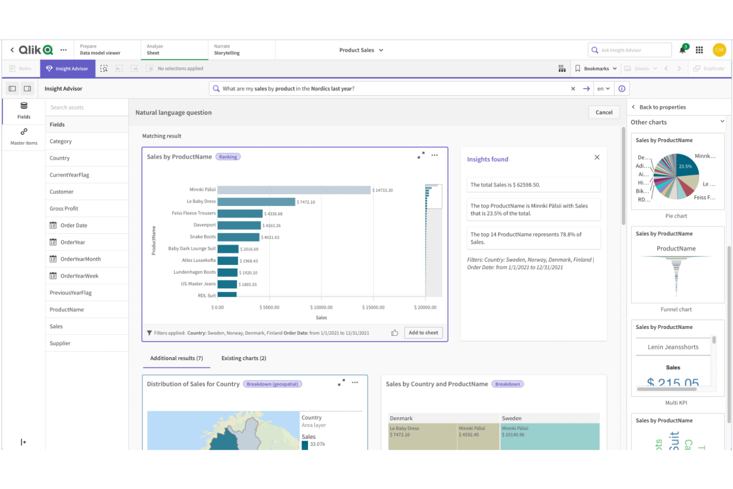
Qlik Sense está diseñado para equipos que necesitan explorar datos complejos e interconectados de múltiples fuentes. Su motor de modelado de datos asociativo permite a los usuarios navegar libremente por las relaciones en sus datos, facilitando la identificación de patrones y conexiones ocultas. Si tu empresa depende de análisis flexibles y profundos sobre conjuntos de datos diversos, Qlik Sense ofrece un enfoque único en comparación con la exploración de datos más lineal de Power BI.
Por qué Qlik Sense es una buena alternativa a Power BI
Lo que distingue a Qlik Sense es su modelado de datos asociativo, que te permite explorar las relaciones de los datos sin estar limitado a jerarquías predefinidas. Elegí Qlik Sense porque su motor permite a los usuarios hacer clic en cualquier punto de datos y ver al instante datos relacionados y no relacionados, facilitando el descubrimiento de información que podría pasar desapercibida en herramientas más lineales como Power BI.
Las funciones interactivas de selección y filtrado de la plataforma ayudan a que sigas tu propio camino de análisis, en lugar de ceñirte a una estructura de desglose fija. Este enfoque es especialmente valioso para los equipos que necesitan analizar datos complejos de múltiples fuentes y desean la libertad de investigar las conexiones a medida que avanzan.
Funciones clave de Qlik Sense
Algunas otras funciones de Qlik Sense que pueden ser útiles para tu equipo incluyen:
- Visualización de datos de autoservicio: Los usuarios pueden crear y personalizar sus propios paneles y reportes sin depender del soporte de TI.
- Analítica aumentada: Capacidades integradas de IA y aprendizaje automático que ayudan con sugerencias y análisis de datos.
- Implementación multinube: Implementa Qlik Sense localmente, en una nube privada o a través de Qlik Cloud para opciones de infraestructura flexibles.
- Alertas de datos: Configura alertas automáticas para notificar a los usuarios cuando los datos cumplen condiciones o umbrales específicos.
Integraciones de Qlik Sense
Las integraciones incluyen Amazon Web Services, Google Cloud, Microsoft Azure, Snowflake, SAP, Databricks, Cloudera, Salesforce, Oracle y Dropbox.
Pros and Cons
Pros:
- IA incorporada que ayuda con análisis de datos
- Opciones de despliegue multinube para alojamiento flexible
- Sólidos controles de gobierno y seguridad de datos
Cons:
- El lenguaje de programación difiere de los estándares SQL
- Menos plantillas predefinidas que Power BI
La flexibilidad del código abierto hace que Metabase sea una excelente opción para equipos que desean tener un control total sobre su entorno de analítica. Los ingenieros de datos, equipos de TI y organizaciones con estrictas necesidades de privacidad de datos suelen elegirlo por sus opciones de autoalojamiento y código transparente. A diferencia de Power BI, Metabase permite desplegar en tu propia infraestructura y personalizar la plataforma para cumplir con tus requisitos de seguridad y cumplimiento.
Por Qué Metabase Es Una Buena Alternativa a Power BI
Si necesitas una plataforma de inteligencia empresarial que permita despliegue de código abierto, Metabase merece la pena considerar. Lo elegí porque puedes autoalojar la plataforma, dando a tu equipo control total sobre el almacenamiento, acceso y seguridad de los datos. La base de código abierto de Metabase también permite modificaciones personalizadas, para que adaptes la plataforma a los requisitos únicos de tu organización. Esta flexibilidad es especialmente valiosa para empresas con normas estrictas de cumplimiento o privacidad que no pueden ser cubiertas por soluciones solo en la nube, como Power BI.
Características Clave de Metabase
Otras características de Metabase que pueden ser útiles para tu equipo incluyen:
- Constructor de Consultas Sin Código: Crea consultas y visualizaciones personalizadas sin escribir SQL.
- Suscripciones Automatizadas a Paneles: Programa el envío de paneles a los usuarios por correo electrónico o Slack.
- Filtrado Interactivo de Datos: Añade filtros a los paneles para que los usuarios puedan explorar datos por segmento o periodo de tiempo.
- Registro de Auditoría: Supervisa la actividad de los usuarios y los cambios dentro de la plataforma para cumplimiento y supervisión.
Integraciones de Metabase
Las integraciones incluyen Amazon Athena, Amazon Redshift, BigQuery, ClickHouse, Databricks, Druid, Google Sheets, MariaDB, Microsoft SQL Server y MongoDB.
Pros and Cons
Pros:
- El autoalojamiento soporta estrictas necesidades de privacidad de datos
- La base de código abierto permite modificaciones personalizadas
- Constructor de consultas sin código para usuarios no técnicos
Cons:
- Sin soporte integrado para R o Python
- La incrustación de paneles requiere configuración adicional

Si necesitas automatizar análisis y reportes recurrentes, Zoho Analytics está diseñado para ello. Es ideal para gerentes de operaciones, equipos de finanzas y líderes empresariales que desean programar, compartir y distribuir informes sin esfuerzo manual. A diferencia de Power BI, Zoho Analytics ofrece opciones integradas y flexibles de programación y entrega de reportes que ayudan a los equipos a mantener informados regularmente a los interesados.
Por qué Zoho Analytics es una buena alternativa a Power BI
Para los equipos que necesitan automatizar la entrega de análisis, Zoho Analytics destaca por sus sólidas capacidades de programación de reportes. Elegí Zoho Analytics porque puedes configurar la generación y distribución recurrente de informes a usuarios o grupos específicos, asegurando que todos reciban los últimos análisis a tiempo.
La plataforma también ofrece entrega automática por correo electrónico y opciones de exportación, por lo que puedes compartir paneles e informes en múltiples formatos sin intervención manual. Esto hace que Zoho Analytics sea una excelente elección para organizaciones que dependen de la puntualidad y consistencia de los informes para tomar decisiones.
Funciones clave de Zoho Analytics
Otras características de Zoho Analytics que pueden ser valiosas para tu equipo incluyen:
- Asistente impulsado por IA (Zia): Haz preguntas en lenguaje natural y obtén visualizaciones e insights al instante.
- Combinación de datos: Combina datos de múltiples fuentes para crear informes y paneles unificados.
- Analítica embebida: Integra informes y paneles interactivos directamente en tus propias aplicaciones o portales.
- Permisos de usuario granulares: Controla el acceso a datos, reportes y paneles a nivel detallado para diferentes usuarios y grupos.
Integraciones de Zoho Analytics
Las integraciones incluyen Zoho CRM, Salesforce, HubSpot, Google Analytics, QuickBooks, Shopify, Xero, Mailchimp, Microsoft Dynamics CRM y Zendesk.
Pros and Cons
Pros:
- La programación automática de reportes permite entregas recurrentes
- El asistente de IA Zia responde consultas en lenguaje natural
- La combinación de datos integra varias fuentes en una sola vista
Cons:
- Capacidades limitadas de modelado avanzado de datos
- Las opciones de diseño de panel pueden resultar restrictivas

Otras alternativas a Power BI
Aquí tienes otras alternativas a Power BI que no entraron en mi lista corta, pero que aún merece la pena revisar:
- Infor Birst
Mejor para arquitectura de datos en red


Criterios para seleccionar alternativas a Power BI
Al seleccionar las mejores alternativas a Power BI para incluir en esta lista, tuve en cuenta las necesidades más comunes de los compradores y los principales retos asociados a las plataformas de inteligencia empresarial y análisis de datos, como permitir el acceso a la información a usuarios no técnicos y soportar modelado de datos complejo. También utilicé el siguiente marco para que mi evaluación fuera estructurada y justa:
Funcionalidad principal (25% del puntaje total)
Para ser considerado en la lista, cada solución debía cubrir estos casos de uso comunes:
- Conectar a múltiples fuentes de datos
- Crear paneles e informes interactivos
- Visualizar datos con gráficos y diagramas
- Programar y automatizar la entrega de informes
- Permitir filtrado de datos y análisis detallado
Otras funciones destacadas (25% del puntaje total)
Para acotar más la competencia, también busqué características distintivas, como:
- Análisis de datos e información impulsados por IA
- Capacidades de consulta en lenguaje natural
- Analítica embebida para aplicaciones de terceros
- Herramientas avanzadas de mapeo geoespacial
- Control de versiones para reportes y paneles
Usabilidad (10% del puntaje total)
Para conocer el nivel de usabilidad de cada sistema, tomé en cuenta lo siguiente:
- Constructor de paneles y reportes intuitivo
- Diseño de interfaz limpio y moderno
- Disposición del espacio de trabajo personalizable
- Rendimiento responsivo con grandes volúmenes de datos
- Accesibilidad para usuarios con distintos niveles de experiencia
Incorporación (10% del puntaje total)
Para evaluar la experiencia de incorporación de cada plataforma, consideré lo siguiente:
- Disponibilidad de recorridos guiados paso a paso por el producto
- Acceso a videos de capacitación y documentación
- Plantillas prediseñadas de paneles y reportes
- Chatbots o ayuda guiada dentro de la app
- Webinars de incorporación en vivo o bajo demanda
Soporte al Cliente (10% del puntaje total)
Para evaluar los servicios de atención al cliente de cada proveedor de software, consideré lo siguiente:
- Disponibilidad de soporte 24/7
- Múltiples canales de atención como chat, correo electrónico y teléfono
- Acceso a una base de conocimientos consultable
- Foros comunitarios para soporte entre usuarios
- Tiempos de respuesta rápidos para problemas técnicos
Relación Calidad-Precio (10% del puntaje total)
Para evaluar la relación calidad-precio de cada plataforma, tomé en cuenta lo siguiente:
- Planes de precios transparentes y flexibles
- Disponibilidad de prueba gratuita o demo
- Características incluidas en cada nivel de precio
- Costo en comparación con herramientas similares
- Descuentos por compromisos anuales o por volumen
Reseñas de Clientes (10% del puntaje total)
Para conocer el grado de satisfacción de los clientes, tomé en cuenta lo siguiente al leer las reseñas:
- Consistencia de comentarios positivos en diferentes fuentes
- Fiabilidad reportada y tiempo de actividad
- Calidad de las experiencias con el soporte al cliente
- Frecuencia de actualizaciones y nuevas funcionalidades
- Ejemplos reales del impacto en el negocio
¿Por Qué Buscar una Alternativa a Power BI?
Aunque Power BI es una de las herramientas de análisis más utilizadas, algunos compradores buscan alternativas que se ajusten mejor a sus flujos de trabajo, necesidades técnicas o presupuesto. Puede que estés considerando otras opciones porque…
- Quieres una interfaz más amigable con un análisis de datos más robusto y facilidad de uso para usuarios no técnicos
- Necesitas una interfaz de arrastrar y soltar más sencilla para crear paneles más rápido
- Tu equipo busca funciones avanzadas y opciones de personalización sin requerir tanto conocimiento técnico
- Buscas herramientas de análisis más rentables para equipos en crecimiento
- Necesitas mejor compatibilidad para conectar y analizar datos de múltiples fuentes
- Deseas acceder a información en tiempo real de manera más rápida y sin una configuración compleja
- Tu organización requiere una solución que se escale fácilmente a nivel empresarial
Si te identificas con alguno de estos puntos, esta lista presenta varias alternativas sólidas que ofrecen capacidades analíticas flexibles, flujos de trabajo más sencillos y mejor alineación con diferentes necesidades empresariales.
Características Clave de Power BI
A continuación se describen algunas de las principales características de Power BI, para ayudarte a contrastar y comparar con las soluciones alternativas:
- Creación interactiva de paneles y reportes
- Integración con los servicios de Microsoft 365 y Azure
- Herramientas para modelado y transformación de datos
- Transmisión y monitoreo de datos en tiempo real
- Consulta en lenguaje natural con la función de Preguntas y Respuestas (Q&A)
- Entrega programada y automática de reportes
- Mercado de visualizaciones personalizadas
- Aplicación móvil para acceso en cualquier lugar
- Seguridad a nivel de fila para la gobernanza de datos
- Colaboración y uso compartido dentro de Microsoft Teams
¿Qué sigue?
Si estás en el proceso de investigar alternativas a Power BI, conéctate con un asesor de SoftwareSelect para recibir recomendaciones gratuitas.
Completa un formulario y tendrás una conversación breve donde analizarán los detalles de tus necesidades. Luego recibirás una lista corta de software para revisar. Incluso te brindarán apoyo durante todo el proceso de compra, incluyendo negociaciones de precios.