13 Power BI Alternatives Picked for 2026

10 Power BI Alternatives Shortlist
Here's my pick of the 10 best software from the 13 tools reviewed.


A strong Power BI alternative gives your team flexible data modeling, interactive dashboards, and reliable integration with your existing data sources. If you’re searching for options beyond Power BI, you likely need a business intelligence platform that matches your reporting needs, supports your workflows, and fits your organization’s scale.
This list will help you compare leading Power BI alternatives, highlighting what each tool does best so you can make an informed decision for your analytics strategy.
What Is Power BI?
Power BI is a business intelligence tool from Microsoft that helps organizations visualize, analyze, and share data insights. It connects to various data sources, allowing users to build dashboards and reports that support cloud-based decision-making. Power BI is widely used by analysts, data teams, and business leaders who need strong analytics capabilities and real-time insights to monitor performance and identify trends.
The platform includes advanced features for data modeling and transformation, but some users may experience a steep learning curve when working with more complex workflows. While it offers a user-friendly interface for basic reporting, certain use cases still require technical expertise, especially at enterprise-levels of data analysis.
Best Power BI Alternatives Summary
This comparison chart summarizes pricing details for my top Power BI alternatives to help you find the best one for your budget and business needs.
| Tool | Best For | Trial Info | Price | ||
|---|---|---|---|---|---|
| 1 | Best for interactive visual exploration | Free demo available | From $75/user/month (billed annually) | Website | |
| 2 | Best for real-time dashboard sharing | 30-day free trial available | Pricing upon request | Website | |
| 3 | Best for embedded analytics customization | Free trial available | Pricing upon request | Website | |
| 4 | Best for complex data integration | 7-day free trial + free demo available | From $399/month | Website | |
| 5 | Best for enterprise planning alignment | Free demo available | Pricing upon request | Website | |
| 6 | Best for AI-powered data insights | 30-day free trial available | From $11.25/user/month | Website | |
| 7 | Best for embedded analytics customization | Free plan available | Pricing upon request | Website | |
| 8 | Best with associative data modeling | Free trial available | From $300/10 users/month (billed annually) | Website | |
| 9 | Best for open-source deployment flexibility | Free plan available | From $6/user/month | Website | |
| 10 | Best for automated report scheduling | Free plan available + 15-day free trial | From $48/month (5 users, billed annually) | Website |
Why Trust Our Software Reviews
-

SupportYourApp
Visit WebsiteThis is an aggregated rating for this tool including ratings from Crozdesk users and ratings from other sites.4.7 -
Freshdesk
Visit WebsiteThis is an aggregated rating for this tool including ratings from Crozdesk users and ratings from other sites.4.4 -
Hiver
Visit WebsiteThis is an aggregated rating for this tool including ratings from Crozdesk users and ratings from other sites.4.6


Power BI Alternatives Reviews
Below are my detailed summaries of the best Power BI alternatives that made it onto my shortlist. My reviews offer a detailed look at the features, integrations, and best use cases of each platform to help you find the best one for you.
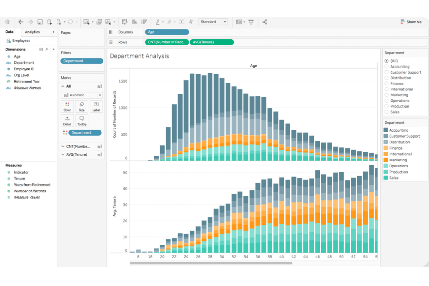
Tableau stands out for teams that need highly interactive and visual data exploration. It’s a strong fit for analysts and business users who want to dig into complex datasets and uncover insights through intuitive drag-and-drop dashboards. If your organization values flexible, visual storytelling with data, Tableau offers a different approach than Power BI’s more structured reporting style.
Why Tableau Is a Good Power BI Alternative
Tableau’s strength in interactive visual exploration makes it a top choice for teams that want to go beyond static dashboards. I picked Tableau for its ability to let users drill down into data, filter on the fly, and build custom visualizations with simple drag-and-drop actions. The platform’s VizQL engine translates user actions into queries, so you can instantly see changes reflected in your charts and graphs. This level of interactivity helps you uncover trends and outliers that might be missed with more rigid reporting tools like Power BI.
Tableau Key Features
Some other features in Tableau that may interest your team include:
- Data Prep with Tableau Prep: Prepare, clean, and shape your data visually before analysis using Tableau Prep’s dedicated interface.
- Live and In-Memory Data Connections: Connect to data in real time or use in-memory extracts for faster performance, depending on your needs.
- Collaboration and Sharing: Share dashboards securely with colleagues or stakeholders through Tableau Server or Tableau Cloud.
- Mobile-Optimized Dashboards: Design dashboards that automatically adjust for mobile devices, making insights accessible on the go.
Tableau Integrations
Integrations include Salesforce CRM, Google Analytics, Amazon Redshift, Snowflake, Microsoft SQL Server, Oracle, SAP HANA, Google BigQuery, Dropbox, and ServiceNow.
Pros and Cons
Pros:
- Handles large and complex datasets smoothly
- Strong support for advanced data visualizations
- Highly flexible drag-and-drop dashboard creation
Cons:
- Custom calculations can be complex to implement
- Steeper resource requirements for on-premises deployment
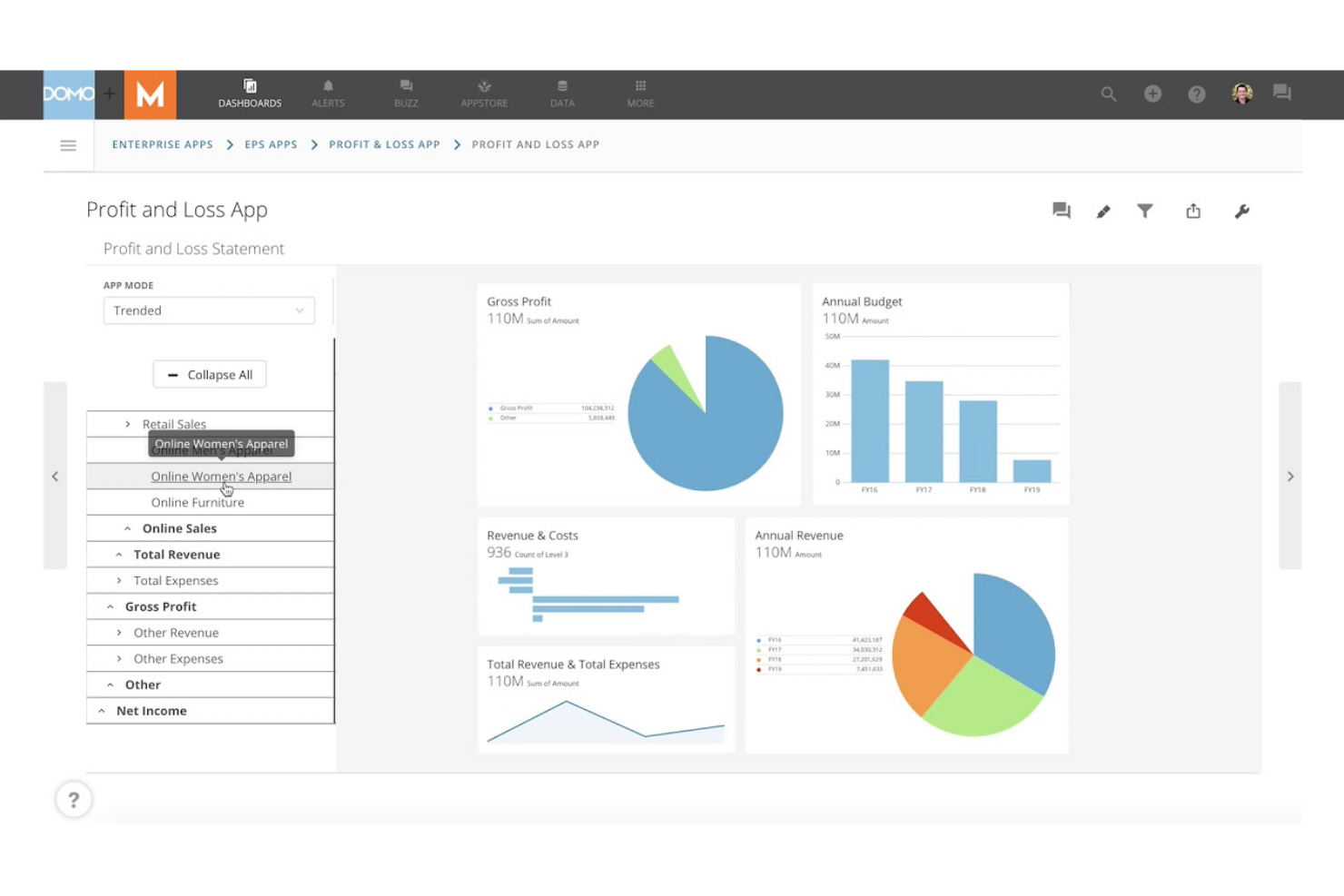
Domo is built for teams that need to share live dashboards and data updates across departments or locations. It’s especially useful for operations leaders, analysts, and executives who rely on up-to-the-minute insights to make fast decisions. Unlike Power BI, Domo emphasizes real-time data sharing and collaboration, so everyone stays aligned as soon as new information becomes available.
Why Domo Is a Good Power BI Alternative
If your team needs to share dashboards and data in real time, Domo is built for that exact purpose. I picked Domo because it lets you publish live dashboards that update instantly as new data flows in, so everyone sees the same numbers at the same time.
Domo also offers interactive sharing features, including customizable alerts and mobile access, which help keep distributed teams connected to the latest insights. This focus on real-time collaboration makes Domo a strong alternative to Power BI for organizations that can’t afford to wait for scheduled refreshes.
Domo Key Features
Some other features in Domo that may be valuable for your team include:
- App Creation Toolkit: Build custom data apps using drag-and-drop tools and prebuilt templates.
- Data Transformation (Magic ETL): Cleanse, join, and transform data visually without writing code.
- Data Governance Controls: Set detailed permissions and monitor data usage across your organization.
- Prebuilt Data Connectors: Connect to hundreds of data sources, including cloud apps, databases, and spreadsheets.
Domo Integrations
Integrations include Salesforce, Google Analytics, Facebook Ads, Twitter, Instagram, Shopify, HubSpot, Marketo, LinkedIn, and Microsoft Dynamics.
Pros and Cons
Pros:
- Mobile app supports on-the-go data access
- Magic ETL enables visual data transformation
- Real-time dashboard updates for instant visibility
Cons:
- Advanced analytics require separate add-ons
- Pricing is not transparent or publicly listed

If your team needs to deliver highly customized analytics within your own products or portals, Looker is built for embedded analytics flexibility. It appeals to SaaS providers, product managers, and data teams who want to control the look, feel, and interactivity of analytics for end users. Unlike Power BI, Looker’s modeling layer and API-driven approach let you tailor data experiences and integrate analytics directly into your workflows.
Why Looker Is a Good Power BI Alternative
Looker stands out for teams that need to embed analytics directly into their own products or customer-facing portals. I picked Looker because its semantic modeling layer (LookML) lets you define and reuse business logic, making it easier to maintain consistent analytics across different environments.
API and developer tools allow you to customize dashboards, visualizations, and user experiences far beyond what Power BI typically offers for embedded use cases. This makes Looker a strong choice if you want to deliver tailored analytics that match your brand and workflow requirements.
Looker Key Features
Some other features in Looker that may be valuable for your team include:
- Scheduled Reporting: Automate report delivery to users or groups on a set schedule.
- Data Exploration Interface: Users can drill down, filter, and pivot data directly within dashboards.
- Row-Level Security: Control data access at a granular level for different users or groups.
- Version Control Integration: Manage LookML models and analytics assets using Git-based version control.
Looker Integrations
Integrations include BigQuery, Snowflake, Redshift, Databricks, Microsoft SQL Server, PostgreSQL, MySQL, Oracle, Google Sheets, and Salesforce.
Pros and Cons
Pros:
- Scheduled delivery of reports and dashboards
- Embedding options support deep product integration
- LookML enables reusable business logic modeling
Cons:
- Requires SQL knowledge for advanced modeling
- No native support for on-premises deployment
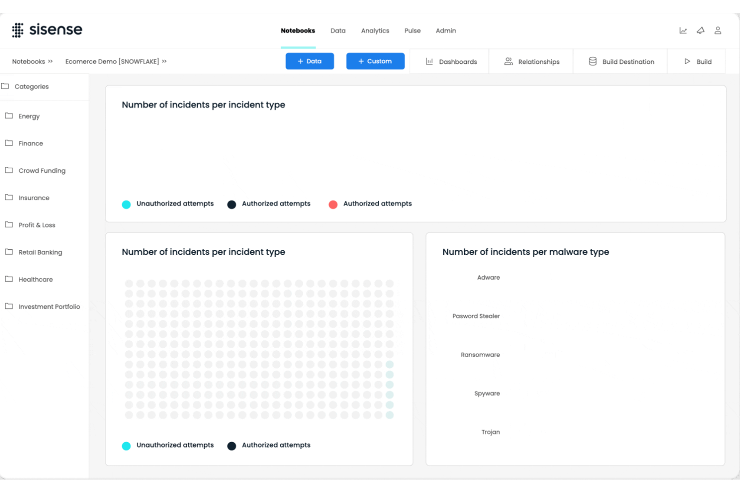
For teams handling data from many sources and formats, Sisense offers advanced capabilities for complex data integration. It’s a strong fit for data engineers, analytics leaders, and IT teams who need to blend, transform, and analyze large or disparate datasets. Unlike Power BI, Sisense’s in-chip technology and flexible data modeling help you unify and query data across cloud, on-premises, and hybrid environments without heavy pre-processing.
Why Sisense Is a Good Power BI Alternative
If your business needs to bring together data from a wide range of sources, Sisense is built for complex data integration scenarios. I picked Sisense because its Elasticube technology lets you blend and model data from cloud, on-premises, and hybrid environments without heavy data prep.
In-chip analytics engine processes large datasets quickly, supporting real-time analysis even when data is highly fragmented. This makes Sisense a strong choice for organizations that need to unify and analyze data from multiple, often incompatible, systems.
Sisense Key Features
Some other features in Sisense that may be useful for your team include:
- White-Labeling: Customize dashboards and analytics with your own branding and design elements.
- AI-Driven Insights: Use built-in AI features to surface trends and anomalies in your data automatically.
- Drag-and-Drop Dashboard Builder: Create interactive dashboards without writing code.
- Role-Based Access Controls: Set granular permissions for users and groups to manage data visibility and actions.
Sisense Integrations
Integrations include Snowflake, Amazon Redshift, Google BigQuery, Databricks, Azure Synapse, MySQL, PostgreSQL, Oracle, Microsoft SQL Server, and Salesforce.
Pros and Cons
Pros:
- In-chip processing accelerates dashboard performance
- White-labeling supports custom-branded analytics portals
- Handles large, complex datasets without lag
Cons:
- Limited visualization types compared to competitors
- Data model changes require full re-indexing
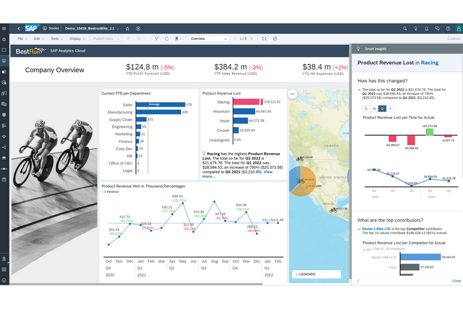
For organizations that need to connect analytics with enterprise planning, SAP Analytics Cloud offers a unified approach. Large enterprises and finance teams often choose it to align forecasting, budgeting, and reporting in one platform. Unlike Power BI, SAP Analytics Cloud brings planning, predictive analytics, and business intelligence together for end-to-end decision support.
Why SAP Analytics Cloud Is a Good Power BI Alternative
What sets SAP Analytics Cloud apart is its deep integration of analytics and enterprise planning in a single platform. I picked it for teams that need to connect financial planning, forecasting, and reporting without switching between multiple tools. The platform’s built-in planning workflows and predictive analytics help organizations align strategy and execution across departments. This makes SAP Analytics Cloud a strong choice for enterprises that want to unify business intelligence and planning in one environment.
SAP Analytics Cloud Key Features
Some other features in SAP Analytics Cloud that may be useful for your team include:
- Smart Insights: Automatically generate explanations for data trends and outliers.
- Live Data Connectivity: Connect directly to SAP and non-SAP data sources without data replication.
- Collaboration Tools: Comment, share, and assign tasks within reports and dashboards.
- Mobile Access: View and interact with dashboards on iOS and Android devices.
SAP Analytics Cloud Integrations
Integrations include SAP HANA, SAP S/4HANA, SAP BW/4HANA, SAP BusinessObjects solutions, SAP Business Planning and Consolidation, OData, and Google BigQuery.
Pros and Cons
Pros:
- Predictive analytics features for business users
- Native integration with SAP ERP systems
- Built-in enterprise planning and forecasting tools
Cons:
- Power BI Performance issues with large data volumes
- Limited visualization customization compared to
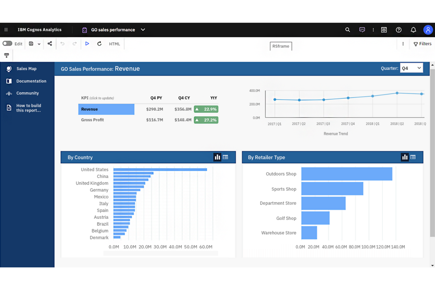
If you’re looking for a business intelligence platform with advanced AI-driven analytics, IBM Cognos Analytics is worth considering. It’s designed for organizations that want to uncover deeper insights from their data using automated data preparation and natural language querying. Unlike Power BI, IBM Cognos Analytics emphasizes AI-powered data discovery and guided analysis for users across business functions.
Why IBM Cognos Analytics Is a Good Power BI Alternative
IBM Cognos Analytics stands out for its AI-powered data insights, which go beyond what you’ll find in most business intelligence platforms. I picked it for teams that want automated data preparation and natural language querying to help users at any skill level uncover trends and patterns.
The platform’s AI Assistant can generate visualizations and suggest insights based on your questions, making data exploration more accessible. This focus on embedded AI and guided analysis makes IBM Cognos Analytics a strong alternative to Power BI for organizations that want to leverage advanced analytics without heavy manual effort.
IBM Cognos Analytics Key Features
Some other features in IBM Cognos Analytics that may be valuable for your team include:
- Data Modeling Tools: Build and manage data models directly within the platform.
- Custom Dashboard Creation: Design interactive dashboards with drag-and-drop components.
- Scheduled Reporting: Automate report generation and delivery on a set schedule.
- Geospatial Analytics: Visualize and analyze data using integrated mapping tools.
IBM Cognos Analytics Integrations
Integrations include IBM Planning Analytics, IBM SPSS Statistics, IBM watsonx, Microsoft Fabric, SAP BW/4HANA, Amazon Web Services, Microsoft Azure, Google Cloud Platform, and Slack.
Pros and Cons
Pros:
- Scheduled reporting automates recurring report delivery
- Built-in data modeling for complex datasets
- AI Assistant generates insights from natural language
Cons:
- Data preparation tools require technical knowledge
- Dashboard design options are less flexible
If your team needs to deliver highly customized analytics within your own products or portals, Looker is built for embedded analytics flexibility. It appeals to SaaS providers, product managers, and data teams who want to control the look, feel, and interactivity of analytics for end users. Unlike Power BI, Looker’s modeling layer and API-driven approach let you tailor data experiences and integrate analytics directly into your workflows.
Why Looker Is a Good Power BI Alternative
Looker stands out for teams that need to embed analytics directly into their own products or customer-facing portals. I picked Looker because its semantic modeling layer (LookML) lets you define and reuse business logic, making it easier to maintain consistent analytics across different environments.
API and developer tools allow you to customize dashboards, visualizations, and user experiences far beyond what Power BI typically offers for embedded use cases. This makes Looker a strong choice if you want to deliver tailored analytics that match your brand and workflow requirements.
Looker Key Features
Some other features in Looker that may be valuable for your team include:
- Scheduled Reporting: Automate report delivery to users or groups on a set schedule.
- Data Exploration Interface: Users can drill down, filter, and pivot data directly within dashboards.
- Row-Level Security: Control data access at a granular level for different users or groups.
- Version Control Integration: Manage LookML models and analytics assets using Git-based version control.
Looker Integrations
Integrations include BigQuery, Snowflake, Redshift, Databricks, Microsoft SQL Server, PostgreSQL, MySQL, Oracle, Google Sheets, and Salesforce.
Pros and Cons
Pros:
- Scheduled delivery of reports and dashboards
- Embedding options support deep product integration
- LookML enables reusable business logic modeling
Cons:
- Requires SQL knowledge for advanced modeling
- No native support for on-premises deployment
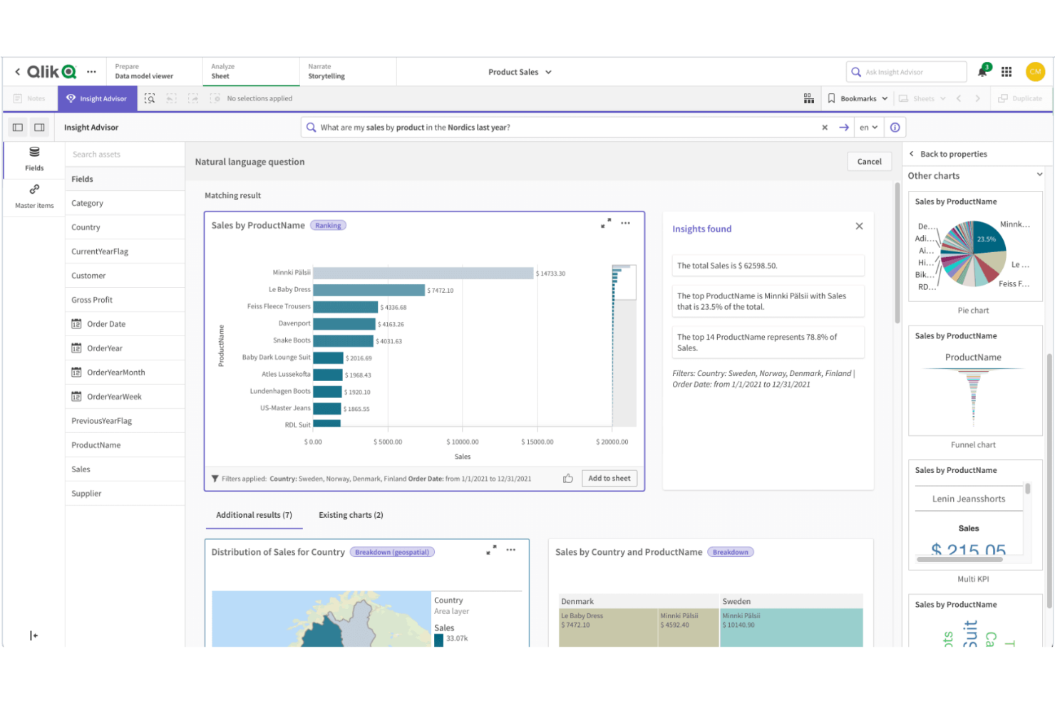
Qlik Sense is designed for teams that need to explore complex, interconnected data from multiple sources. Its associative data modeling engine lets users freely navigate relationships in their data, making it easier to spot hidden patterns and connections. If your business relies on flexible, in-depth analysis across diverse datasets, Qlik Sense offers a unique approach compared to Power BI’s more linear data exploration.
Why Qlik Sense Is a Good Power BI Alternative
What sets Qlik Sense apart is its associative data modeling, which lets you explore data relationships without being limited to predefined hierarchies. I picked Qlik Sense because its engine allows users to click on any data point and instantly see related and unrelated data, making it easier to uncover insights that might be missed in more linear tools like Power BI.
The platform’s interactive selection and filtering features help you follow your own analysis path, rather than sticking to a set drill-down structure. This approach is especially valuable for teams that need to analyze complex, multi-source data and want the freedom to investigate connections as they go.
Qlik Sense Key Features
Some other features in Qlik Sense that may be useful for your team include:
- Self-Service Data Visualization: Users can create and customize their own dashboards and reports without IT support.
- Augmented Analytics: Built-in AI and machine learning capabilities assist with data insights and suggestions.
- Multi-Cloud Deployment: Deploy Qlik Sense on-premises, in a private cloud, or through Qlik Cloud for flexible infrastructure options.
- Data Alerts: Set up automated alerts to notify users when data meets specific conditions or thresholds.
Qlik Sense Integrations
Integrations include Amazon Web Services, Google Cloud, Microsoft Azure, Snowflake, SAP, Databricks, Cloudera, Salesforce, Oracle, and Dropbox.
Pros and Cons
Pros:
- Strong data governance and security controls
- Multi-cloud deployment options for flexible hosting
- Built-in AI assists with data insights
Cons:
- Fewer pre-built templates than Power BI
- Scripting language differs from SQL standards
Open-source flexibility makes Metabase a strong fit for teams that want full control over their analytics environment. Data engineers, IT teams, and organizations with strict data privacy needs often choose it for its self-hosting options and transparent codebase. Unlike Power BI, Metabase lets you deploy on your own infrastructure and customize the platform to match your security and compliance requirements.
Why Metabase Is a Good Power BI Alternative
If you need a business intelligence platform that supports open-source deployment, Metabase is worth considering. I picked it because you can self-host the platform, giving your team full control over data storage, access, and security. Metabase’s open-source codebase also allows for custom modifications, so you can tailor the platform to your organization’s unique requirements. This flexibility is especially valuable for businesses with strict compliance or privacy standards that can’t be met by cloud-only solutions like Power BI.
Metabase Key Features
Some other features in Metabase that may be useful for your team include:
- No-Code Query Builder: Create custom queries and visualizations without writing SQL.
- Automated Dashboard Subscriptions: Schedule dashboards to be sent to users by email or Slack.
- Interactive Data Filtering: Add filters to dashboards so viewers can explore data by segment or timeframe.
- Audit Logging: Track user activity and changes within the platform for compliance and oversight.
Metabase Integrations
Integrations include Amazon Athena, Amazon Redshift, BigQuery, ClickHouse, Databricks, Druid, Google Sheets, MariaDB, Microsoft SQL Server, and MongoDB.
Pros and Cons
Pros:
- No-code query builder for non-technical users
- Open-source codebase allows custom modifications
- Self-hosting supports strict data privacy needs
Cons:
- Embedding dashboards needs additional configuration
- No built-in support for R or Python
If you need to automate recurring analytics and reporting, Zoho Analytics is designed with this in mind. It’s a strong fit for operations managers, finance teams, and business leaders who want to schedule, share, and distribute reports without manual effort. Unlike Power BI, Zoho Analytics offers built-in, flexible report scheduling and delivery options that help teams keep stakeholders informed regularly.
Why Zoho Analytics Is a Good Power BI Alternative
For teams that need to automate the delivery of analytics, Zoho Analytics stands out with its robust report scheduling capabilities. I picked Zoho Analytics because you can set up recurring report generation and distribution to specific users or groups, ensuring everyone receives the latest insights on time.
The platform also supports automated email delivery and export options, so you can share dashboards and reports in multiple formats without manual intervention. This makes Zoho Analytics a strong choice for organizations that rely on timely, consistent reporting to drive decisions.
Zoho Analytics Key Features
Some other features in Zoho Analytics that may be valuable for your team include:
- AI-Powered Assistant (Zia): Ask questions in natural language and get instant visualizations and insights.
- Data Blending: Combine data from multiple sources to create unified reports and dashboards.
- Embedded Analytics: Integrate interactive reports and dashboards directly into your own applications or portals.
- Granular User Permissions: Control access to data, reports, and dashboards at a detailed level for different users and groups.
Zoho Analytics Integrations
Integrations include Zoho CRM, Salesforce, HubSpot, Google Analytics, QuickBooks, Shopify, Xero, Mailchimp, Microsoft Dynamics CRM, and Zendesk.
Pros and Cons
Pros:
- Data blending combines multiple sources in one view
- AI assistant Zia answers natural language queries
- Automated report scheduling supports recurring delivery
Cons:
- Dashboard design options can feel restrictive
- Limited advanced data modeling capabilities
New Product Updates from Zoho Analytics

Zoho Analytics Enhances Analysis, Reporting, and Real-Time Data
Zoho Analytics brings richer PDF exports, smarter multi-table auto analysis, and real-time data connections. These updates help teams generate deeper insights, preserve report accuracy, and analyze data in real time with less manual effort. For more information, visit Zoho Analytics’ official site.
 .
.Other Power BI Alternatives
Here are some additional Power BI alternatives that didn’t make it onto my shortlist, but are still worth checking out:
- MicroStrategy
For scalable enterprise reporting
- GoodData
With white-label analytics delivery
- Infor Birst
For networked data architecture


Power BI Alternatives Selection Criteria
When selecting the best Power BI alternatives to include in this list, I considered common buyer needs and pain points related to business intelligence and data analytics platform products, like enabling non-technical users to access insights and supporting complex data modeling. I also used the following framework to keep my evaluation structured and fair:
Core Functionality (25% of total score)
To be considered for inclusion in this list, each solution had to fulfill these common use cases:
- Connect to multiple data sources
- Create interactive dashboards and reports
- Visualize data with charts and graphs
- Schedule and automate report delivery
- Support data filtering and drill-down
Additional Standout Features (25% of total score)
To help further narrow down the competition, I also looked for unique features, such as:
- AI-powered data analysis and insights
- Natural language query capabilities
- Embedded analytics for third-party apps
- Advanced geospatial mapping tools
- Version control for reports and dashboards
Usability (10% of total score)
To get a sense of the usability of each system, I considered the following:
- Intuitive dashboard and report builder
- Clean and modern interface design
- Customizable workspace layouts
- Responsive performance with large datasets
- Accessibility for users with different skill levels
Onboarding (10% of total score)
To evaluate the onboarding experience for each platform, I considered the following:
- Availability of step-by-step product tours
- Access to training videos and documentation
- Pre-built dashboard and report templates
- In-app chatbots or guided help
- Live or on-demand onboarding webinars
Customer Support (10% of total score)
To assess each software provider’s customer support services, I considered the following:
- 24/7 support availability
- Multiple support channels like chat, email, and phone
- Access to a searchable knowledge base
- Community forums for peer support
- Fast response times for technical issues
Value For Money (10% of total score)
To evaluate the value for money of each platform, I considered the following:
- Transparent and flexible pricing plans
- Free trial or demo availability
- Features included at each pricing tier
- Cost compared to similar tools
- Discounts for annual or volume commitments
Customer Reviews (10% of total score)
To get a sense of overall customer satisfaction, I considered the following when reading customer reviews:
- Consistency of positive feedback across sources
- Reported reliability and uptime
- Quality of customer support experiences
- Frequency of updates and new features
- Real-world examples of business impact
Why Look For a Power BI Alternative?
While Power BI is one of the most widely used analytics tools, some software buyers look for alternatives that better match their workflows, technical needs, or budget. You might be considering other options because…
- You want a more user-friendly interface with stronger data analysis and ease of use for non-technical users
- You need a simpler drag-and-drop interface for faster dashboard creation
- Your team wants advanced features and customization options without requiring as much technical expertise
- You are looking for more cost-effective analytics tools for growing teams
- You need better support for connecting and analyzing data from various data sources
- You want faster access to real-time insights without the complex setup
- Your organization needs a solution that scales more easily across enterprise-levels
If any of these sound like you, this list highlights several strong alternatives that offer flexible analytics capabilities, easier workflows, and better alignment with different business needs.
Power BI Key Features
Here are some of the key features of Power BI, to help you contrast and compare what alternative solutions offer:
- Interactive dashboard and report creation
- Integration with Microsoft 365 and Azure services
- Data modeling and transformation tools
- Real-time data streaming and monitoring
- Natural language query with Q&A feature
- Scheduled and automated report delivery
- Custom visualizations marketplace
- Mobile app for on-the-go access
- Row-level security for data governance
- Collaboration and sharing within Microsoft Teams
What’s Next:
If you're in the process of researching Power BI alternatives, connect with a SoftwareSelect advisor for free recommendations.
You fill out a form and have a quick chat where they get into the specifics of your needs. Then you'll get a shortlist of software to review. They'll even support you through the entire buying process, including price negotiations.