10 Best Heatmap Software Shortlist
Here's my pick of the 10 best software from the 20 tools reviewed.


With so many different heatmap software solutions available, figuring out which is right for you is tough. You know you want to get a better understanding of how users interact with your digital products, but you need to figure out which option is best. In this post, I'll help you make your choice easier by sharing my insights on the best heatmap software to visualize and analyze user behavior.
Why Trust Our Reviews
We’ve been testing and reviewing heatmap software since 2021. As CX professionals ourselves, we know how critical and difficult it is to make the right decision when selecting software.
We invest in deep research to help our audience make better software purchasing decisions. We’ve tested more than 2,000 tools for different customer experience use cases and written over 1,000 comprehensive software reviews. Learn how we stay transparent & our software review methodology.
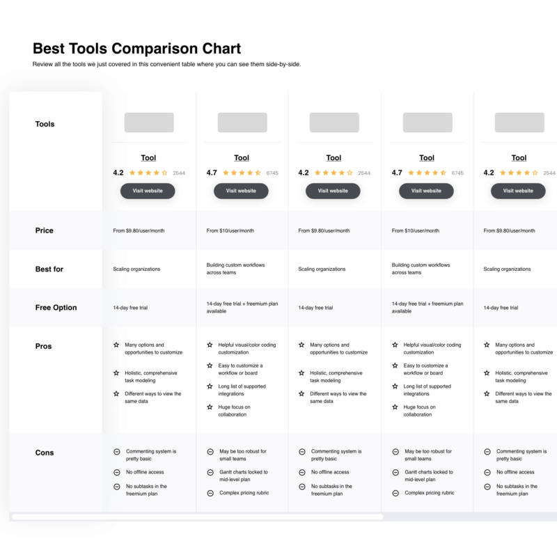
The 10 Best Heatmap Software Systems Comparison Chart
This comparison chart summarizes basic details about my selections for the best heatmap software. You can view pricing details and the availability of free trials or demos side-by-side to help you find the best software for your budget and business needs.
| Tools | Price | |
|---|---|---|
| Mouseflow | From $39/month | Website |
| Smartlook | From $55/month | Website |
| Glassbox | Pricing upon request | Website |
| FullStory | From $199/month | Website |
| Plerdy | From $32/month | Website |
| Hotjar | From $59/month | Website |
| VWO | From $173/month (billed annually) | Website |
| Lucky Orange | From $18/month | Website |
| Crazy Egg | From $29/user/month | Website |
| Inspectlet | From $39/month | Website |
Compare Software Specs Side by Side
Use our comparison chart to review and evaluate software specs side-by-side.
Compare SoftwareHow to Choose Heatmap Software
Choosing the right heatmap software can enhance website usability, optimize conversion paths, and accelerate problem-solving by identifying user behavior trends and areas of user struggle on your digital platforms.
As you're shortlisting, trialing, and selecting customer segmentation tools consider the following:
- What problem are you trying to solve - Start by identifying the heatmap software feature gap you're trying to fill to clarify the features and functionality the heatmap software needs to provide.
- Who will need to use it - To evaluate cost and requirements, consider who'll be using the software and how many licenses you'll need. You'll need to evaluate if it'll just be the CX team or the whole organization that requires access. When that's clear, it's worth considering if you're prioritizing ease of use for all, or speed for your heatmap software power users.
- What other tools it needs to work with - Clarify what tools you're replacing, what tools are staying, and the tools you'll need to integrate with, such as accounting, CRM or HR software. You'll need to decide if the tools will need to integrate together, or alternatively, if you can replace multiple tools with one consolidated heatmap software.
- What outcomes are important - Consider the result that the software needs to deliver to be considered a success. Consider what capability you want to gain, or what you want to improve, and how you will be measuring success. For example, an outcome could be the ability to get greater visibility into performance. You could compare heatmap software features until you’re blue in the face but if you aren’t thinking about the outcomes you want to drive, you could be wasting a lot of valuable time.
- How it would work within your organization - Consider the software selection alongside your workflows and delivery methodology. Evaluate what's working well, and the areas that are causing issues that need to be addressed. Remember every business is different — don’t assume that because a tool is popular that it'll work in your organization.
Best Heatmap Software Systems Reviews
Here’s my evaluation of the best heatmap software you can use today, along with a summary of their key features and a short explanation of why I chose these specific tools over others.

Mouseflow is a behavior analytics tool that helps you find out what happens when visitors land on your website. The solution enables you to detect the geographical locations of your most active users so you can improve your funnel analysis and optimize your PPC campaigns.
Why I picked Mouseflow: Mouseflow made my list because it shows huge potential for businesses who rely on PPC ads to drive traffic to their website. The software’s geo heatmaps allow you to determine where your most engaged users come from so you can improve your marketing efforts in specific geographical areas.
The software also enables you to assess the effectiveness of your dynamic content, such as menus, sliders, or forms, so you can get more insights into your overlay clickable elements. In addition, I also liked the automated attention stats the software produces. These stats enable you to assess how persuasive your landing pages are, going beyond scroll heatmaps and clicks on CTAs.
Mouseflow Standout Features and Integrations:
Standout features include click maps, movement heatmaps, and user engagement assessment tools. I particularly liked the automated friction scores and attention stats. The friction scores help you understand whether users are happy with a page or not, and then guide you to the heatmaps it used for the assessment so you can make your own conclusions and optimize the user journey.
Integrations include most CMS, analytics, A/B testing, and web-building platforms out there, including HubSpot, Adobe Analytics, Segment, Google Tag Manager, Google Optimize, Unbounce, WordPress, Shopify, Magento, Wix, and Drupal.
Pros and cons
Pros:
- Screen recordings automatically highlight important moments
- Good user segmentation capabilities
- Frustration scores help you identify valuable user recordings
Cons:
- All your user session replays are saved in the same folder, so they can be difficult to find
- Onboarding could be better

Smartlook is a qualitative analytics solution that helps you understand user behavior. The solution enables you to generate heatmaps for your mobile apps so you can identify weak spots and optimize them for better in-app experiences.
Why I picked Smartlook: Smartlook has a lightweight software development kit (SDK) that integrates with the most popular programming frameworks, allowing you to user-test your product. The solution automatically hides sensitive information during the screen recordings, so all the data you collect on individual users is GDPR compliant.
Smartlook tracks all the key actions users perform on your app and creates statistics you can use to analyze the data. You can use filters to hone in on specific events, and you can watch screen recordings of the moments before crashes were reported.
Smartlook Standout Features and Integrations:
Standout features include different ways of capturing your screen data. I like the fact that you can switch between four rendering modes – rendering, native rendering, wireframe mode, and games recording – so you can focus on what’s important to you. For example, if you’re interested in examining your UI, you can view your app in the wireframe mode. This mode replaces texts and images with abstract representations, allowing you to easily track how users interact with them.
Integrations include 20+ CRM, analytics, sales, and app development frameworks, including HubSpot, Unity, React Native, iOS, Cocos, Unreal Engine, Zendesk, Slack, Segment, Optimizely, Google Analytics, and Amplitude.
Pros and cons
Pros:
- Offers in-depth insights on mobile app usage
- Integrates with most app dev frameworks
- Enables you to see how users interact with your product in real time
Cons:
- Exporting data in bulk can be difficult
- Reports could benefit from more customization

Glassbox is an analytics and digital experience platform that enables you to understand your audience’s struggles and optimize their customer journey. The software enables you to identify weak spots in your conversion funnels and offers AI-powered recommendations so you can improve them.
Why I picked Glassbox: Glassbox combines qualitative and quantitative data to create detailed customer journeys for your website or app users. The solution enables you to collect details on how visitors engage with different elements, allowing you to compare results between different audience segments or A/B test variants.
With Glassbox, you can assess how many users interact with each element of the page, determine which elements move leads down your funnels, and evaluate the revenue impact of each change you make in your A/B tests. The software’s AI takes all this data into consideration and recommends changes that can improve customer experience and increase your revenue.
Glassbox Standout Features and Integrations:
Standout features include interaction maps, zone analysis, scroll depth heatmaps, audience segmentation, and A/B testing analysis. I’m a fan of Glassbox’s side-by-side analysis. This feature enables you to compare data on multiple audience segments or test variants side-by-side, making it easy to spot improvement opportunities. Being able to assess the revenue impact your changes have can be eye-opening for UX teams.
Integrations include popular analytics and marketing apps, such as Google Analytics, Adobe Analytics, Branch, Adobe Audience Manager, Tealium, Adobe Experience Cloud, Google Tag Manager, Medallia, Jira, Slack, and Qualtrics.
Pros and cons
Pros:
- Great at tracking and interpreting individual user journeys
- Helpful AI-driven recommendations
- UI is clean and easy to use
Cons:
- Configuring the tool for A/B tests can be challenging for new users
- Pricing details are not transparent

Fullstory is a digital experience and user behavior analysis tool that enables you to determine how well your product is optimized for user interactions. The solution helps you uncover pain points your users may have during their journey so you can solve them for a better user experience.
Why I picked Fullstory: Fullstory made my list because it makes it easy to determine whether users are satisfied with your product’s interface or whether they find it frustrating. During my tests, the product seemed better at tracking clicks than other mapping software in this list, making it my top recommendation for frustration signals tracking.
Fullstory keeps an accurate record of your users’ error clicks, dead clicks, and rage clicks. One of the advantages of tracking these metrics separately is that it enables you to identify javascript errors and faulty designs that may convince your users to click on unclickable elements. This helps you remove the pain points and optimize your web pages for user interactions.
Fullstory Standout Features and Integrations:
Features that make Fullstory great for frustration signals tracking include scroll depth heatmaps, click heatmaps, session recordings, and funnel tracking. I’m a fan of Fullstory’s ability to quantify the revenue you lose to friction – the software is able to aggregate your data and tell you how many prospects fell out of your conversion funnels after they encountered certain faulty elements.
Integrations include popular web analytics tools, communication apps, and A/B testing software, such as Microsoft Teams, Snowflake, Productboard, Jira, Intercom, Google Tag Manager, Google Analytics, Workato, Slack, and Salesforce.
Pros and cons
Pros:
- Makes it easy to find valuable session recordings
- Helps you identify bugs and design errors
- Great at aggregating data and producing insights
Cons:
- Prices are not disclosed on the website
- Steep learning curve

Plerdy is a CRO and SEO platform that helps you improve your website’s search engine ranking and increase its conversions. The solution enables you to see how users coming from different channels act so you can optimize their browsing experience.
Why I picked Plerdy: Plerdy enables you to analyze your direct and organic channels separately and compare the behavior of different user segments. The platform allows you to track the activity of your user segments throughout their buying journey so you can identify which web elements move the prospects through your funnels and which are not effective.
Plerdy can accurately track your users’ first clicks, making it easy to assess the effectiveness of your banners, CTAs, and button copy. The software’s dynamic heatmaps also lets you evaluate your audience’s interactions with your website’s interactive blocks, such as pop-ups, sliders, or menus.
Plerdy Standout Features and Integrations:
Features that make Plerdy a great choice for ecommerce specialists include first-click analysis, scroll depth, and click sequences. Click sequences allows you to track the activity of individual users on your website, so you can see what elements encourage interaction and which make your users fall out of your funnels.
Integrations include popular CMS, analytics, and email marketing platforms, such as WordPress, Opencart, Shopify, Google Search Console, Google Analytics, MailChimp, SendPulse, Brevo, Semrush, and UniSender.
Pros and cons
Pros:
- Rich library of training videos
- Can be used for A/B testing
- Platform is constantly being updated and improved
Cons:
- Interface can feel clunky to new users
- It can sometimes be difficult to find the feature you want

Hotjar is a product experience insights platform that enables you to record and interpret your audience’s activity on your website or app. The solution combines multiple features to provide ample data about your users’ behavior.
Why I picked Hotjar: I chose Hotjar because it gives you access to a suite of features that help you understand your customers. Besides heatmaps, the software also allows you to record your visitor’s activity and see how they navigate your product, highlighting moments where your users click on something, become enraged, or leave the page, so you can save time when watching the recordings.
With Hotjar, you can set up heatmaps on multiple pages at once. This helps you take a closer look at your prospect’s entire buying journey, so you can see where your users drop off and take action to improve your funnels. The solution doesn’t only map out where visitors click, it also tracks their mouse movement, so you can see where they stop to read more and where they scroll without reading the copy.
Hotjar Standout Features and Integrations:
Standout features include heatmaps, visitor recordings, conversion funnels, and feedback collection tools. What makes Hotjar stand out is how easy it is to combine these features in order to gain deep insights into your customer’s likes and dislikes.
Integrations are available with most A/B testing and analytics software, including Google Analytics, Google Optimize, Segment, Optimizely, Unbounce, Omniconvert, or Mixpanel. Hotjar also integrates with CRMs and communication solutions, such as HubSpot, WordPress, WooCommerce Slack, or Microsoft Teams.
Pros and cons
Pros:
- Combines multiple features to produce insights about your users
- Tracks mouse movement and hovering
- Great customer onboarding experience
Cons:
- Can take a toll on your website’s performance
- Pricing plans can be confusing

VWO is a web testing and conversion rate optimization (CRO) platform that helps you improve the experiences you provide to your customers. The software enables you to create distinct views for user segments based on custom triggers and criteria.
Why I picked VWO: VWO is a versatile mapping software that enables you to capture your visitors’ actions and interpret them using different types of heatmaps – mouse tracking heatmaps, click maps, and scroll depth heatmaps. The solution made it into my top 10 thanks to its ability to segment your visitors based on custom triggers and criteria, allowing you to hone in on your target audience’s behavior.
VWO’s segmentation capabilities make it a great choice for you if you’re building a product for a detailed customer profile. You can use the tool’s segmentation features to see how your ideal users navigate your product, what roadblocks they encounter, and whether they’re frustrated or satisfied so you can optimize their experience further.
VWO Standout Features and Integrations:
Standout features include shareable user sessions, in-session notes, and real-time tracking – features that enable you to collaborate with team members to better understand your target audience. You can create custom tracking triggers, so you can identify members of your audience that match your ideal customer profiles.
Integrations include analytics, CMS, communication, and ecommerce platforms, such as Shopify, Demandbase, Drupal, WordPress, Contentful, Adobe Analytics, Google Analytics, 6sense, BigCommerce, Clearbit, and Slack.
Pros and cons
Pros:
- Detailed reports
- Great user segmentation capabilities
- You can share reports and link them to specific sessions
Cons:
- Steep learning curve
- UI sometimes feels clunky

Lucky Orange is a conversion optimization platform that produces dynamic heatmaps of your users’ activity. The software offers multiple features that allow you to understand your users and communicate with them in real-time.
Why I picked Lucky Orange: Lucky Orange automatically creates highlights of your users’ activity during the recorded sessions. You can also use filters to find recordings where users perform certain actions, such as rage-clicking or scrolling fast so you can see what initiated their behavior.
Lucky Orange records everything the user does on a web page, including them clicking on dynamic elements, such as pop-ups or menus. This helps you understand whether your marketing or data-collection efforts are working or whether you should optimize them further.
Lucky Orange Standout Features and Integrations:
Standout features include element analytics and dynamic heatmaps. When you combine these two features, you get an accurate idea of the efficiency of different elements on the page, such as buttons, images or videos, or pop-ups. The software also has a built-in segmentation feature, allowing you to see which type of visitors behave in certain ways.
Integrations include popular analytics and testing solutions, such as Google Analytics or Google Optimize, as well as ecommerce platforms and CRMs, such as BigCommerce, Shopify, WordPress, Square, and HubSpot. You can also connect Lucky Orange to a Zapier account to access additional integrations.
Pros and cons
Pros:
- Cost-efficient solution
- Good event filters
- Live chat allows you to proactively engage website visitors
Cons:
- Analytics could be more detailed
- Interface can feel clunky at times

Crazy Egg is a user experience and analytics platform that combines multiple tools to help you optimize your product for visitor behavior so you can increase your conversion rates.
Why I picked Crazy Egg: Even though Crazy Egg is not as flashy as some of the other heatmapping tools I included on this list, I chose this software because it offers a great user experience thanks to its clean navigation. This makes the solution friendly toward novice UX specialists who are just starting their heatmapping experiments.
Crazy Egg is also versatile, enabling you to understand your customers with multiple types of heatmaps. You can create heatmaps that track clicks, clicks segmented by source or other criteria, scroll depth, and the effectiveness of different page elements. This helps you understand which parts of your page are popular and which could be further improved.
Crazy Egg Standout Features and Integrations:
Standout features: Crazy Egg’s Confetti heatmap is a valuable tool for you if you want to optimize your conversion funnels. This feature enables you to see where visitors who clicked on an element came from so you can determine which are your most effective sources without difficulty. The software also enables you to record your users’ activity, so you can see how they use your product and identify patterns.
Integrations include all popular website-building platforms, including WordPress, Squarespace, Joomla, Wix, Shopify, and Drupal. The solution also offers native integrations with Google Tag Manager, Segment, Unbounce, and Adobe Tag Manager. In addition, you can use Zapier to connect Crazy Egg with more apps.
Pros and cons
Pros:
- Simple install and onboarding processes
- Multiple types of heatmaps are available
- Great customer support
Cons:
- Can lag when processing a lot of data
- Could use more filters to segment user recordings

Inspectlet is a web analytics and user experience tool that helps you capture your visitors’ activity. The solution enables you to determine what form elements prevent your visitors from completing and submitting the forms.
Why I picked Inspectlet: Inspectlet does a great job at tracking how much time your visitors take to complete different form fields. This helps you identify improvement opportunities so you can optimize your forms for a superior user experience.
Besides keeping track of your website’s forms, Inspectlet can also help you understand your users better with the help of dynamic heatmaps. Their dynamic heatmaps track mouse movements and clicks, allowing you to see which of your buttons, banners, and links are effective and which aren’t.
Inspectlet Standout Features and Integrations:
Standout features include click heatmaps, scroll heatmaps, and A/B testing. I like Inspectlet’s eye-tracking heatmaps, which combines your users’ mouse movements with their algorithm to determine what your audience is most likely looking at, allowing you to assess your website’s design and visual elements.
Integrations include a few native connections with popular solutions, such as HubSpot, Shopify, Google Tag Manager, and Squarespace. You can also use Zapier to integrate Inspectlet with other solutions.
Pros and cons
Pros:
- Friendly toward novice users
- Comprehensive reports
- Filters help you find valuable user sessions
Cons:
- Limited customization options
- User sessions are automatically deleted after 60 days
Other Heatmap Software
Here are some other solutions I shortlisted during my research – even though they didn’t make it into my top 10, they’re still worth checking out:
- NotifyVisitors
Best for multiple domain usage
- Zoho PageSense
Best for attention tracking
- Instapage
Best for A/B testing assessments
- LiveSession
Best for advanced filters
- FigPii
Best for simple reporting
- Attention Insight
Best for concept validation
- Heatmap
Best for detecting conversion blockers
- Matomo
Best for small businesses and startups
- Contentsquare
Best for design validation
- Microsoft Clarity
Best for area heatmaps


Related CX Software Reviews
If you still haven't found what you're looking for here, check out these related customer experience management tools that we've tested and evaluated.
- Customer Service Software
- Help Desk Software
- Call Center Software
- Customer Messaging Platform
- Digital Experience Platform
- Sentiment Analysis Tools
Selection Criteria for Heatmap Software
Heatmap software is designed to visualize user interactions, optimize website functionality, and provide valuable insights into customer behavior. Having personally tried and researched various heatmap platforms,
I have developed criteria tailored to software buyers' needs and pain points. Effective heatmap software should offer a comprehensive set of features, allowing users to gather actionable insights about how visitors interact with their websites.
Core heatmap software Functionality:
Common features for heatmap software typically include click tracking, mouse movement analysis, scroll depth tracking, real-time data visualization, user segmentation, session replays, responsive compatibility, interaction heatmaps, data exporting, and privacy compliance tools.
To be considered for inclusion on my list of the best heatmap software, the solution had to support the ability to fulfill common use cases. These include:
- Monitoring user engagement on key website areas
- Identifying usability issues on web pages
- Analyzing the effectiveness of page layouts
- Enhancing navigation through usability insights
- Optimizing landing pages to improve conversion rates
Additional Standout Features:
- Distinct analytics tools such as predictive heatmaps or AI-driven user behavior predictions
- Integration with advanced A/B testing platforms or marketing automation tools
- Unique data segmentation capabilities that offer deeper insights into specific user groups
- Customizable data dashboards that can be tailored to specific analytical needs
- Advanced privacy features ensuring compliance with global data protection regulations
Usability:
- I prioritize intuitive interfaces that allow new users to quickly grasp the software's functionality.
- A clean, organized layout that facilitates easy access to all features.
- Visual data representation must be both comprehensive and easily digestible for users of all expertise levels.
Onboarding:
- The presence of comprehensive training modules and resources like video tutorials and step-by-step guides.
- Interactive product tours that familiarize new users with the main features.
- Availability of customer support through multiple channels from the outset.
Customer Support:
- A responsive support team that provides fast and helpful solutions to user inquiries.
- The availability of a robust knowledge base or FAQs that allow users to self-serve common issues and questions.
- Multi-channel support, including live chat, email, and phone support, tailored to user preferences.
Value For Money:
- Competitive pricing models that offer good cost-to-feature ratios.
- Flexible subscription plans suitable for businesses of all sizes.
- Clear communication of features included in each pricing tier to ensure buyers can make informed decisions.
Customer Reviews:
- Consistent user feedback that highlights reliability and effectiveness.
- Reviews that detail positive experiences with customer support and ease of use.
- Feedback that frequently praises the software for improving website performance and user engagement metrics.
This comprehensive evaluation framework ensures that selected heatmap software not only meets generic requirements but also excels in specific areas that directly impact business success and user satisfaction. By adopting these criteria, buyers can confidently choose a heatmap solution that aligns with their strategic goals and delivers measurable improvements in user experience and conversion rates.
Trends in Heatmap Software for 2024
In 2024, heatmap software continues to evolve rapidly, reflecting the growing emphasis on enhancing user experience and optimizing digital product design. A review of recent product updates, press releases, and release logs from leading providers sheds light on several key trends in this technology sector.
These insights are crucial for customer experience (CX) professionals aiming to leverage the latest advancements to gain a deeper understanding of user behavior and effectively respond to shifting user demands.
- Increased Integration with AI and Machine Learning: Heatmap tools are increasingly incorporating AI to offer predictive analytics and automated insight generation. This shift allows CX professionals to anticipate user needs and address potential issues before they escalate, enhancing proactive decision-making.
- Enhanced Real-Time Data Capabilities: The ability to monitor user interactions in real-time has become a standard expectation in heatmap software. This functionality enables immediate responses to user behavior, facilitating more dynamic adjustments to website and app designs.
- Expansion of User Segmentation Features: Advanced user segmentation capabilities are being developed to provide more granular insights into different user groups. This functionality supports more personalized user experience strategies, which are essential for engaging diverse audiences effectively.
- Growth in Mobile Optimization: As mobile traffic increases, heatmap software is focusing more on mobile user interactions. Enhancements in mobile-responsive heatmaps ensure that CX professionals can accurately track and analyze behaviors across all device types.
- Session Replay Enhancements: Session replay functionalities have seen significant improvements, providing more detailed and actionable insights. These enhancements help in understanding complex user journeys and pinpointing specific friction points within the digital experience.
- Voice and Video Heatmaps: Some tools have started experimenting with heatmaps for voice and video interactions, a novel approach that addresses the growing use of multimedia content in digital platforms. This functionality is particularly innovative, catering to the needs of platforms incorporating more dynamic content forms.
- Detailed Click and Scroll Tracking: Detailed tracking of clicks and scroll depth continues to be highly demanded. These features are critical for analyzing the effectiveness of page layouts and content placement, directly impacting conversion rates and user engagement.
These trends indicate a clear direction towards more adaptive, proactive, and user-focused heatmap solutions. By staying ahead of these developments, CX professionals can ensure that their strategies are aligned with the best practices in digital user experience, leading to improved customer satisfaction and business outcomes.
What is Heatmap Software?
Heatmap software is a digital tool that enables you to break down user behavior and create color-coded visual representations of user’s activity on your website or app. This type of tool helps data analysts, user experience researchers, web designers, and marketing professionals learn more about their target audience, allowing them to identify behavior patterns and improvement opportunities. It does so through features like click tracking, scroll maps, user session recording, and device tracking.
Using heatmap software can help you improve the usability of your website or app by identifying problem areas to fix or other digital elements to optimize for better conversion rates. The data collected helps uncover user behaviors that aid decision-making, leading to more effective digital products.
Features of Heatmap Software
Heatmap software equips your team with the tools necessary to visualize user activity and optimize your website or application based on actual user interactions. Here are the most important features to consider when selecting heatmap software:
- Real-Time Data Tracking: This feature allows you to observe user behavior as it happens. Immediate insights are crucial for adjusting strategies swiftly and improving user experience.
- User Segmentation: The ability to segment heatmaps by user demographics or behavior patterns lets you tailor your analysis and understand specific groups more deeply.
- Click Tracking: This records where users click most frequently on a page. Understanding where users are most engaged helps prioritize content and design elements.
- Scroll Depth Analysis: Tracking how far users scroll can reveal how much of your content is actually being consumed, which aids in optimizing the placement of important information.
- Heatmap Playback: Playback features replay sessions of user interactions. Seeing how users navigate in real time can uncover usability issues that may not be apparent from static data alone.
- Integration Capabilities: Seamless integration with other analytics tools and platforms expands the utility of the heatmap data, making it a part of a holistic analysis ecosystem.
- Responsive Heatmaps: Ensuring heatmaps are compatible with all devices and screen sizes is essential, as this affects the accuracy of user interaction data across platforms.
- Hover and Interaction Tracking: Beyond clicks, tracking mouse movement and hovers provides insights into user intent and areas of interest that might not lead to a click.
- Detailed Reporting and Exporting: The ability to create detailed reports and export data for further analysis allows for more in-depth study and sharing of insights with team members.
- Privacy Compliance: Ensuring that the software complies with global privacy laws protects user data and shields your company from legal issues.
Choosing the right heatmap software is vital for understanding the nuances of how users interact with your website or application. Each of these features contributes to a robust toolset that can revolutionize your approach to user experience design and optimization.
Benefits of Heatmap Software
By utilizing heatmap software, you can dramatically improve your understanding of user interactions, ensuring your digital platforms resonate more effectively in a competitive market. Here are five primary benefits of heatmap software for users and organizations:
- Enhanced User Experience Design
Heatmaps visually reveal user interaction patterns, allowing you to optimize design elements for improved usability. This results in a more intuitive and user-friendly interface that meets the needs of your audience. - Increased Conversion Rates
By identifying where users focus their attention, heatmap software helps pinpoint effective elements that drive conversions. Optimizing these areas can lead to significant increases in user engagement and sales. - Streamlined Troubleshooting
Quickly identify usability issues where users drop off or exhibit confusion. Heatmaps accelerate the diagnosis and resolution of problems, potentially saving costs and improving customer satisfaction. - Data-Driven Decisions
The quantitative insights provided by heatmaps support objective decision-making. This eliminates guesswork, enabling you to implement changes that are backed by solid data. - Improved Content Placement
Understanding where users are most likely to focus allows for strategic content placement. This ensures that key messages and calls to action are seen, increasing their effectiveness and impact.
Heatmap software equips you with the necessary tools to connect more profoundly with users. As you strive to remain competitive and user-focused, the insights gained from heatmap software are invaluable in shaping strategies that lead to sustained business success.
Costs & Pricing for Heatmap Software
Heatmap software comes with various pricing and plan options, each designed to meet different business needs and scales. Understanding these plans and what they offer is key to selecting a software package that aligns with your organization's goals and budget. Here's a snapshot of typical plan options you might encounter:
| Plan Type | Average Price | Common Features |
|---|---|---|
| Free | $0 | Basic heatmap, limited pageviews, and session replays |
| Basic | $10 - $50/month | Up to 10,000 pageviews, click tracking, basic reports |
| Professional | $50 - $100/month | Up to 100,000 pageviews, full heatmap suite, API access, more detailed analytics |
| Enterprise | $100+ /month | Unlimited pageviews, advanced segmentation, dedicated support, custom integrations |
When selecting a heatmap software plan, consider the volume of your web traffic, the depth of insights needed, and the level of customization you require. Keep in mind that the right software should not only fit your current needs but also scale with your organization. Balancing functionality with cost will ensure you receive value from your investment and support your business's user experience objectives effectively.
FAQs About Heatmap Software
Want to learn more about heatmaps and how to use them? Here are some common questions people ask about this topic:
What type of data is visualized best using a heatmap?
Heatmaps are great at creating visual representations of user behavior data, such as your visitors’ clicking patterns, scroll depth, and mouse movements. This data can be valuable, as it can help you create lifelike customer personas.
What customer insights can you gain from using heatmap software?
Heatmap software can offer a wide variety of customer insights. They can help you determine which areas of your page are engaging and which aren’t, which buttons and links your audience is more likely to click on, what form fields users are more hesitant to complete, and what page elements attract the attention of your visitors. The good news is that you can turn these insights into action.
Are there other types of customer analytics that can improve my customer experience?
Yes. You can combine heatmap software with sentiment analysis tools, customer journey mapping software, and customer segmentation solutions to create in-depth personas of your ideal users. Read our article offering an Easy-to-Follow Guide to Customer Journey Analytics to find out more.
What other analytics software reviews are available?
If you want to accomplish more with the data you gather about your target audience, here are some other reviews from experts at the CX Lead:
- 22 Best Website Analytics Tools for Visitor Stats
- 10 Best A/B Testing Tools for Data-Driven Experiments
- 10 Best Big Data Customer Analytics Software
- 10 Best Customer Segmentation Tools
- 18 Best Sentiment Analysis Tools
- 29 Best Net Promoter Score Software & NPS Survey Tools
- 10 Best Usability Testing Tools for Improving Your UX
- 10 Best Web Design Software
- 10 Best Mockup Tools for Drafting Designs
- 20 Best UX Testing Software Reviewed For 2024
Final Thoughts
Heatmap software offers insights on how to optimize your product for a superior user experience and increased conversions. Using heatmap software during your A/B tests can significantly increase your chances of beating the control, allowing you to improve your results with each consecutive test.
As John Lincoln, CEO of Ignite Visibility, said: “Understanding how your visitors interact with your site’s content, structure, and on-page elements allows you to build a strategy that gets users to stick around, [...] and ultimately, convert more often.
Heatmaps serve as an ideal starting point, allowing marketers to identify big-picture problems that cause friction and new opportunities to drive traffic and conversions.”
Don't forget to subscribe to the CX Lead newsletter. You'll receive advice on how to optimize your product for better user experiences directly in your inbox.